
Dashboards
Dashboards are configurable pages for visualizing and interacting with your IoT data. They are built from widgets — charts, tables, maps, controls, and more — and can display data from any combination of devices, assets, or other entities.
Before getting started, review the key concepts — states, aliases, layouts, actions, and time windows — that make up every dashboard.
Create Dashboard
Section titled “Create Dashboard”- From the sidebar, navigate to Dashboards.
- Click the + Add dashboard ⇾ Create new dashboard in the top right corner.
- Enter a dashboard title (all other settings are optional).
- If needed: In Owner and groups, change the dashboard owner or add it to a group.
- Click Add. A new dashboard opens in edit mode, where you can add widgets, configure settings, and modify the layout — click Save in the upper-right corner to store it
Configure Dashboard with AI
Section titled “Configure Dashboard with AI”Configure with AI lets you set up or modify a dashboard by describing what you want in plain language, instead of manually configuring aliases, time window, states, and widgets one by one. See the AI Assistant guide for how the Assistant works more generally and what else it can configure.
It’s useful whenever you know what you want to see but don’t want to build it widget-by-widget — for example:
- Creating a first set of widgets for a device or a fleet of devices
- Restructuring an existing dashboard’s layout
- Adding a visualization for specific telemetry or attributes
- Updating dashboard configuration — aliases, time window, or states — to match a new requirement
Workflow
- Click Configure with AI to open the AI Assistant panel — from the Dashboards page to start a new dashboard, or from within an existing dashboard’s toolbar to modify it.
- Describe the change you want in the chat — what data to show and how, e.g. “Show SN-001 device’s latest telemetry as value cards, a trend chart, and a table of its active alarms.” Use the suggested prompts if you’re not sure where to start.
- The Assistant explains its plan, then proposes each change — such as adding an entity alias, updating dashboard settings, adding widgets, or renaming a state — as an approval card describing exactly what will happen.
- Click Approve on each proposal to apply it, Deny to skip it, or Approve all further actions to apply the rest of the plan without confirming each step individually.
- Keep the conversation open to refine the result — reply with follow-up instructions (add a widget, change a chart type, rename a state) instead of starting over.
Best Practices
- Describe the outcome and the data you want to see — let the Assistant choose the widgets and layout.
- Name the device, asset, or fleet clearly so the Assistant sets up the right entity alias.
- For complex dashboards, build them up with a few focused prompts instead of one long request.
- Review each proposed change before approving, especially before using Approve all further actions.
Limitations
- Changes are proposed, not applied silently: each one needs your approval, unless you choose to approve all further actions in that chat.
- The Assistant may rename existing resources as part of its plan, such as a dashboard state — review the plan if you want to keep the original names.
Dashboard Toolbar
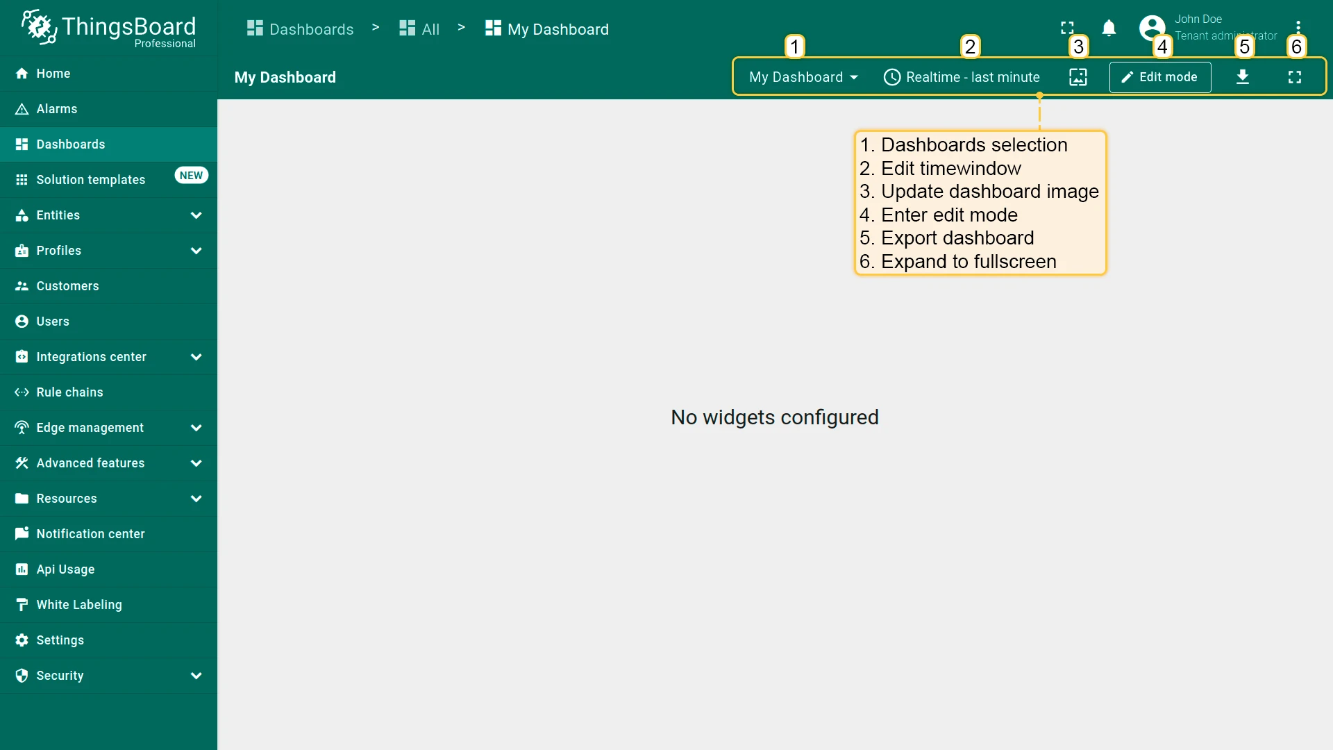
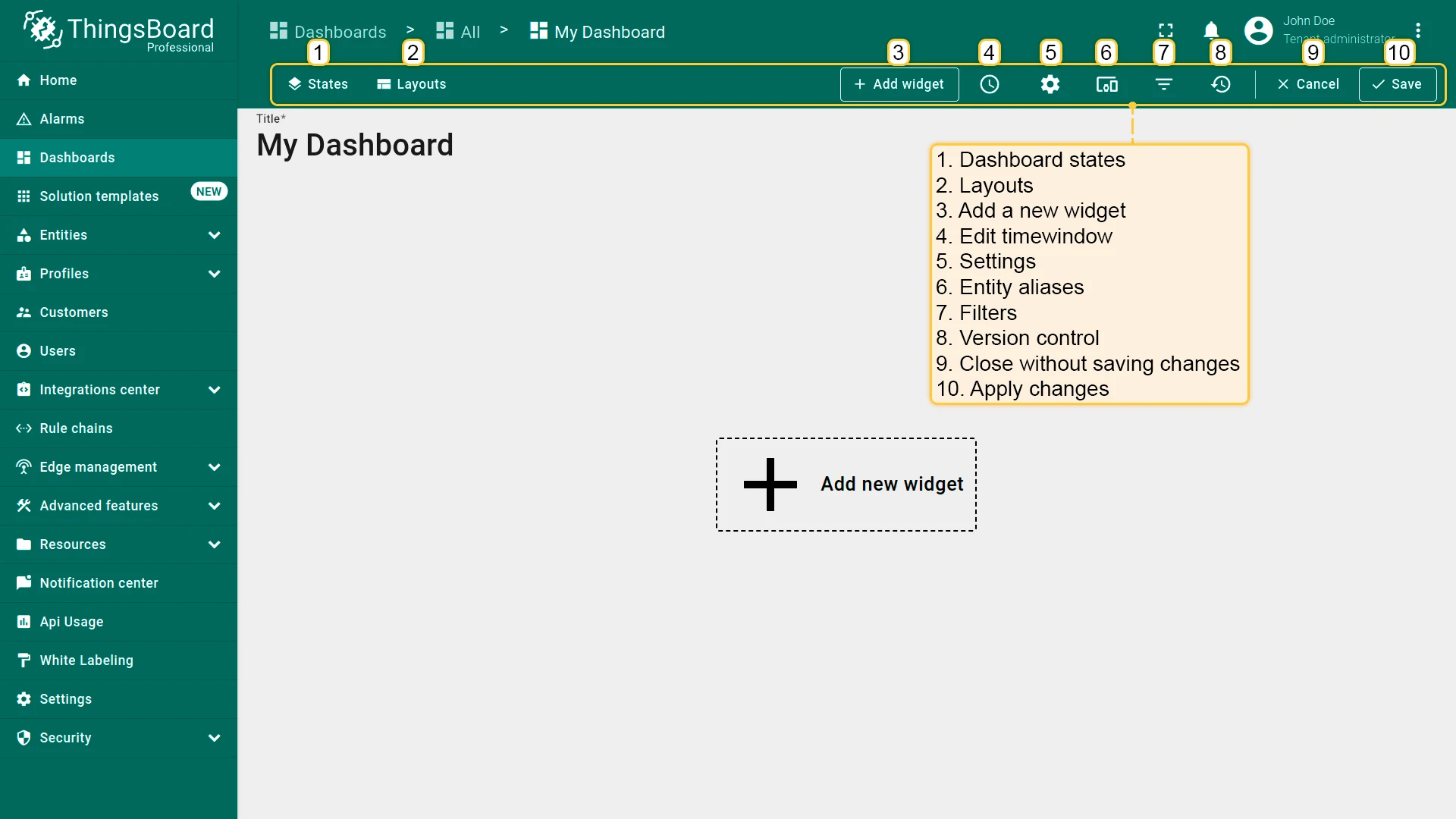
Section titled “Dashboard Toolbar”The dashboard toolbar provides tools for adding widgets, exporting the dashboard, and managing states, layouts, aliases, filters, time window, and other settings.
Some controls are visible only in edit mode; others are available in view mode.
Add a New Widget
Section titled “Add a New Widget”In edit mode, click Add widget in the toolbar to open the widget library, then pick a widget to add it to the current layout.
ThingsBoard provides a wide range of customizable widgets — charts, tables, maps, controls, alarms, and more — organized into bundles by category. Each widget offers settings to tailor its appearance and behavior to your use case.
Explore the available widgets and their configuration options in the Widgets documentation.
Filters
Section titled “Filters”Filters narrow which data appears on the dashboard.
Multiple key filters are combined with and; within a single key, complex expressions with and/or like (A > 0 and A < 20) or (A = 50 or A = 60) are supported.
Each filter checks one or more key conditions against an attribute or telemetry key — for example, show only devices where model = "DHT22" and battery < 20.
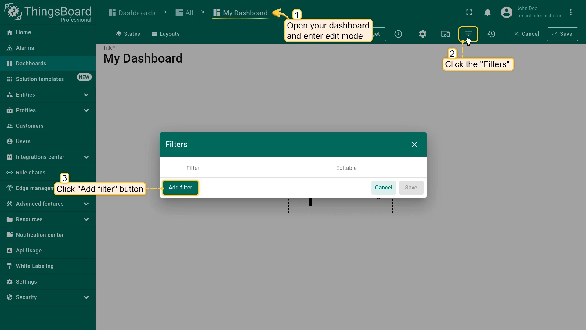
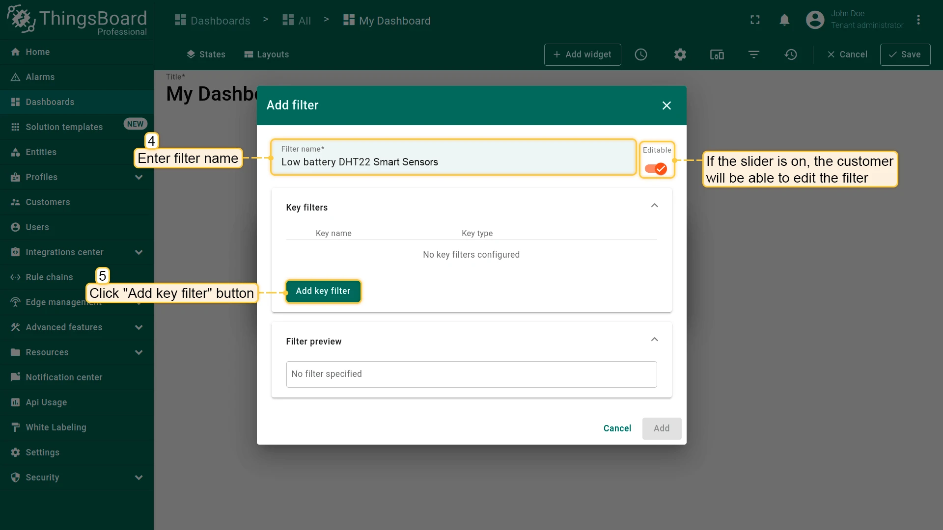
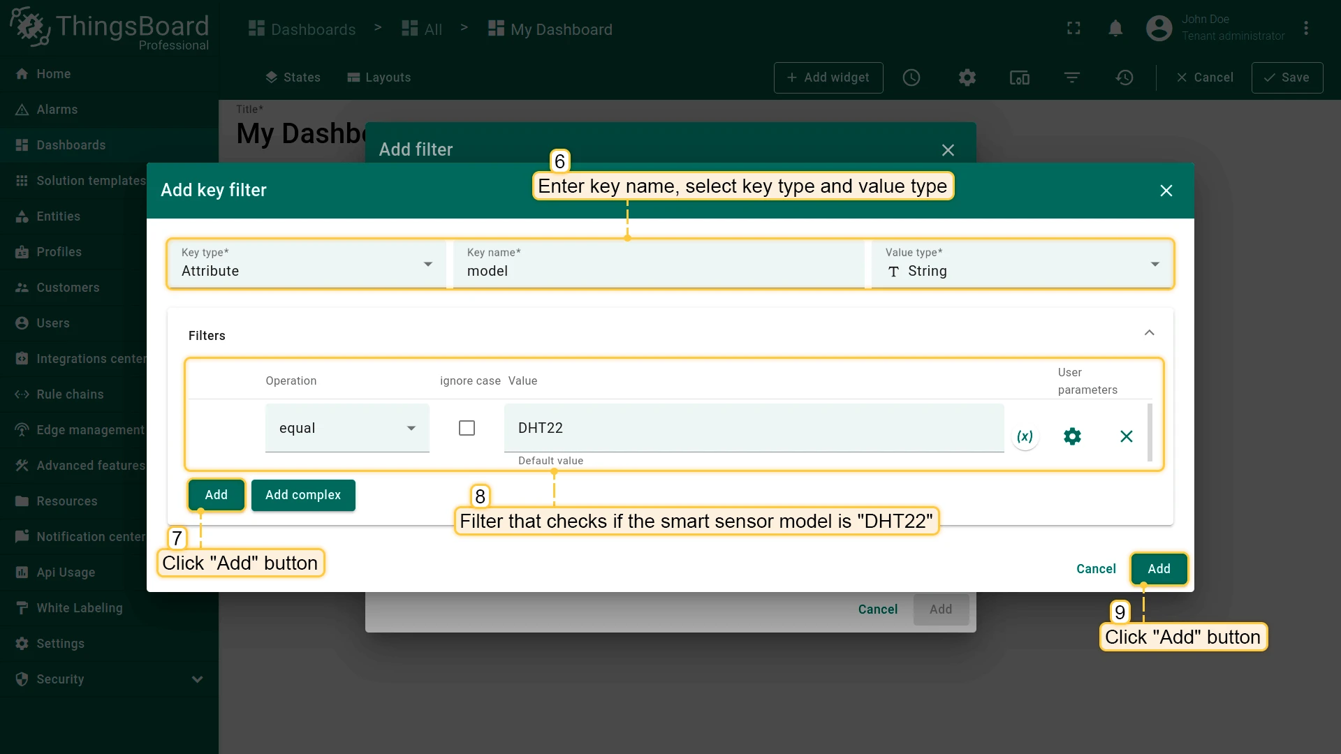
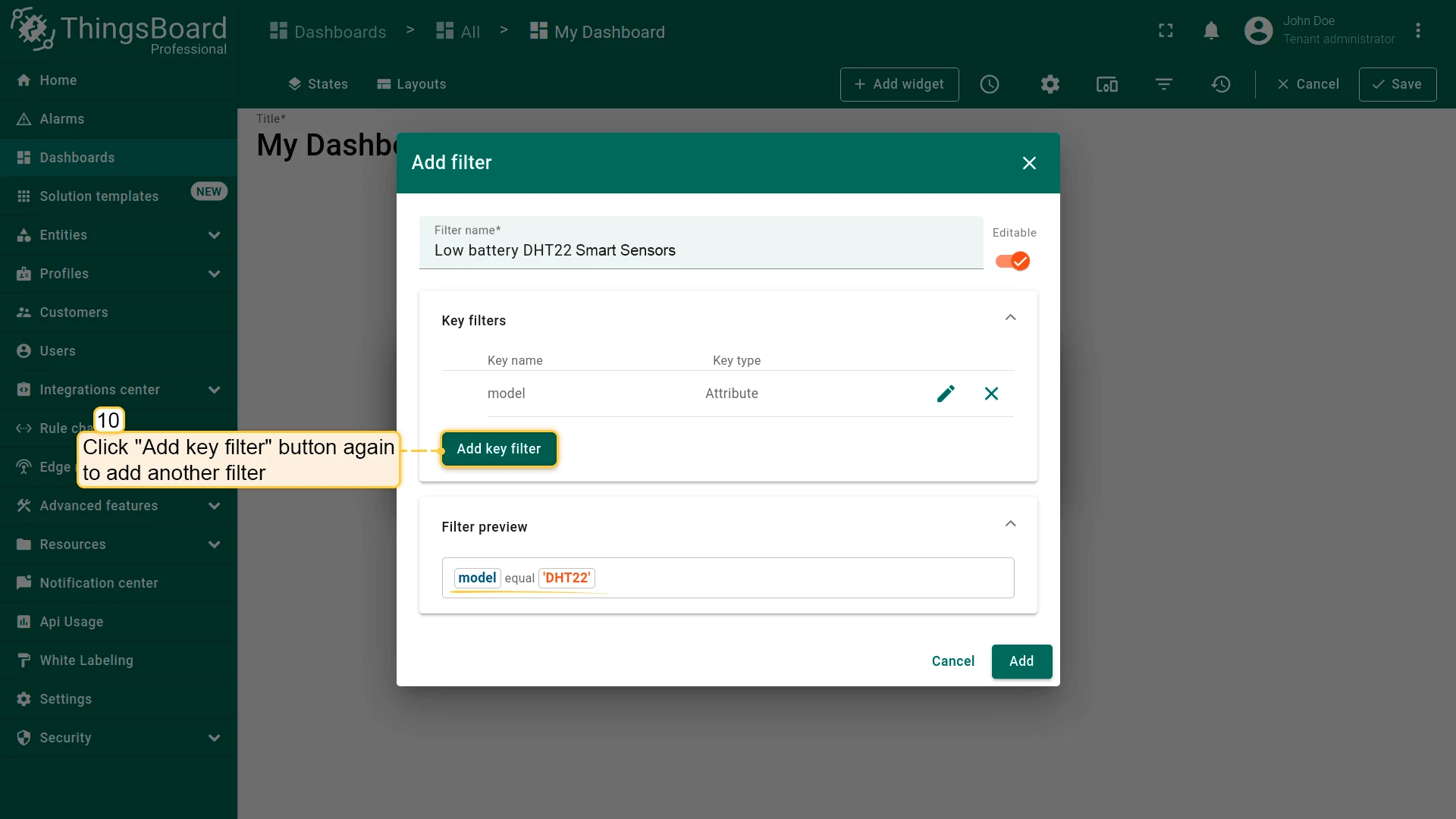
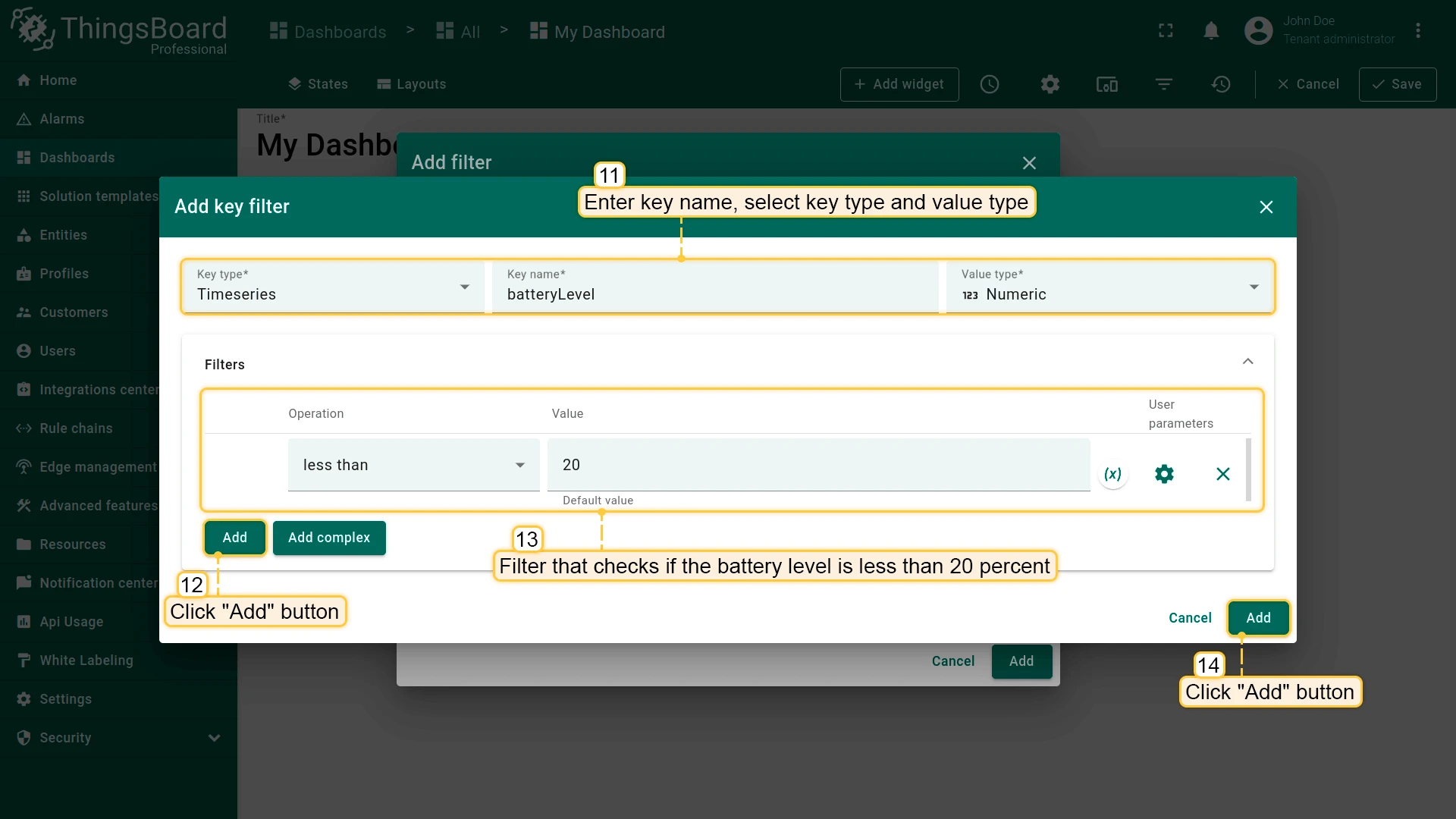
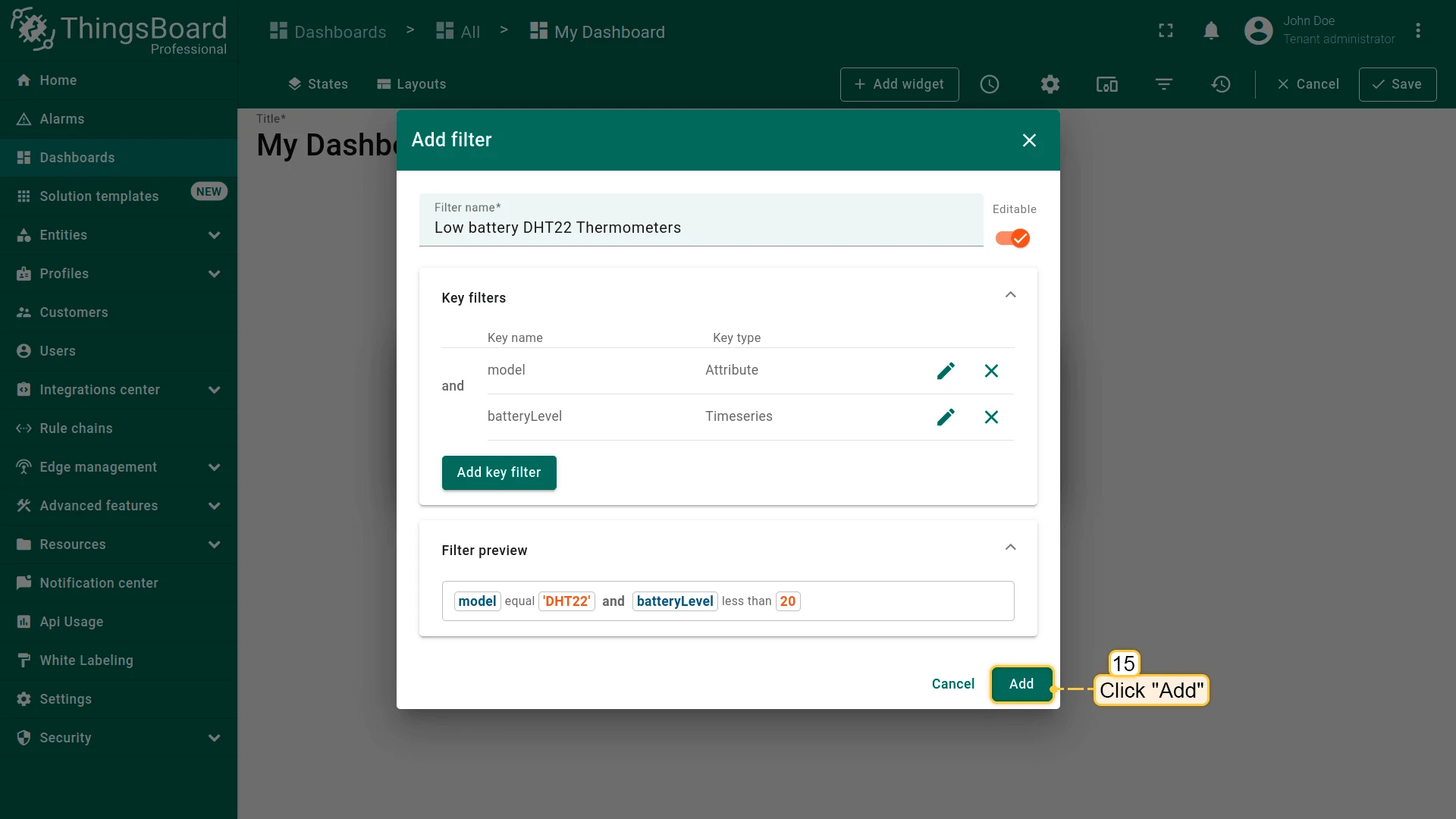
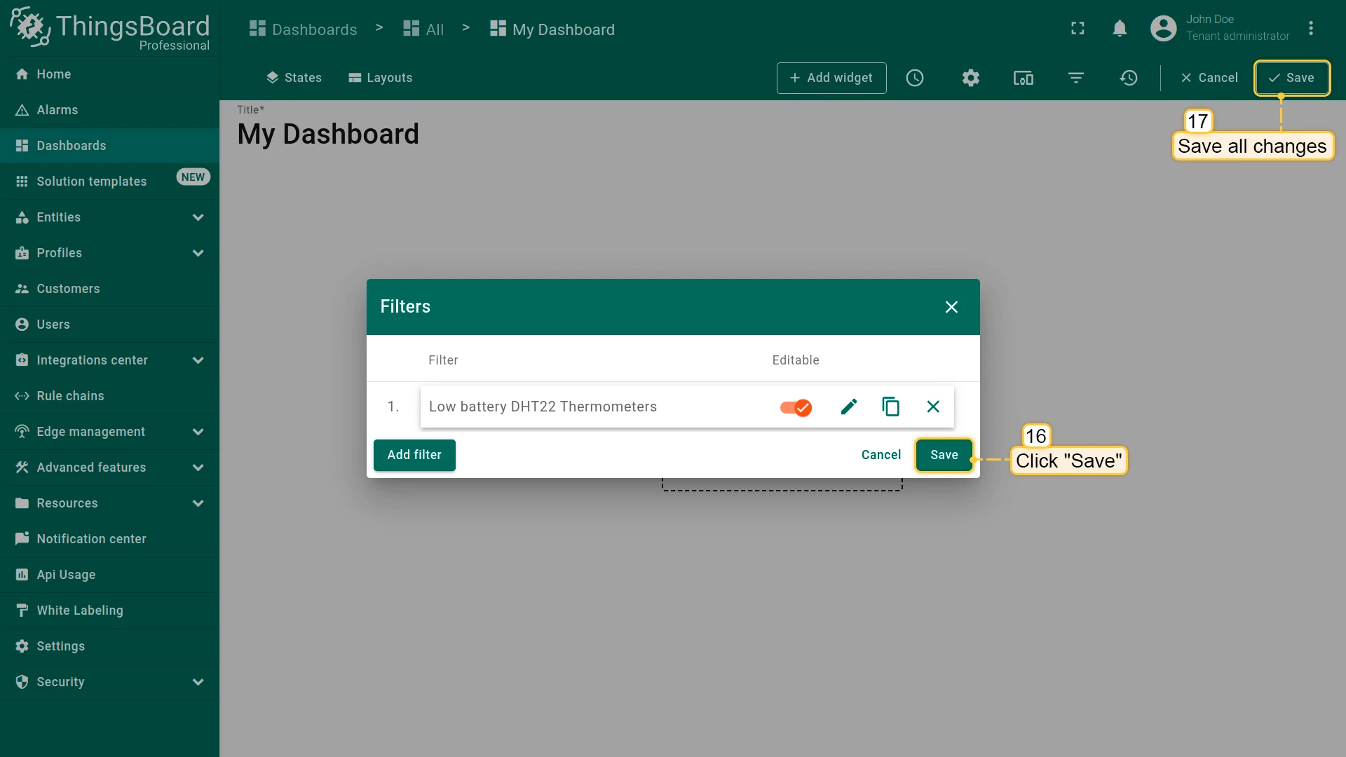
See Filters for more details.
Dashboard Settings
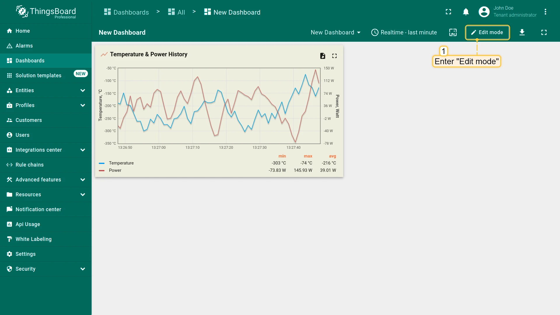
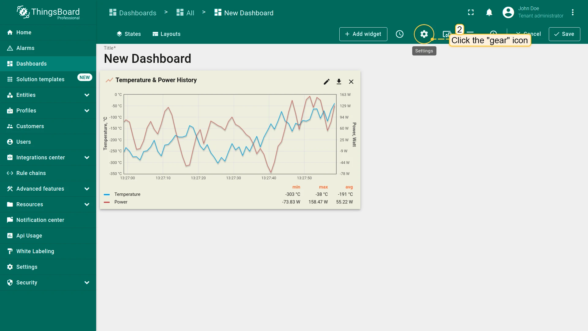
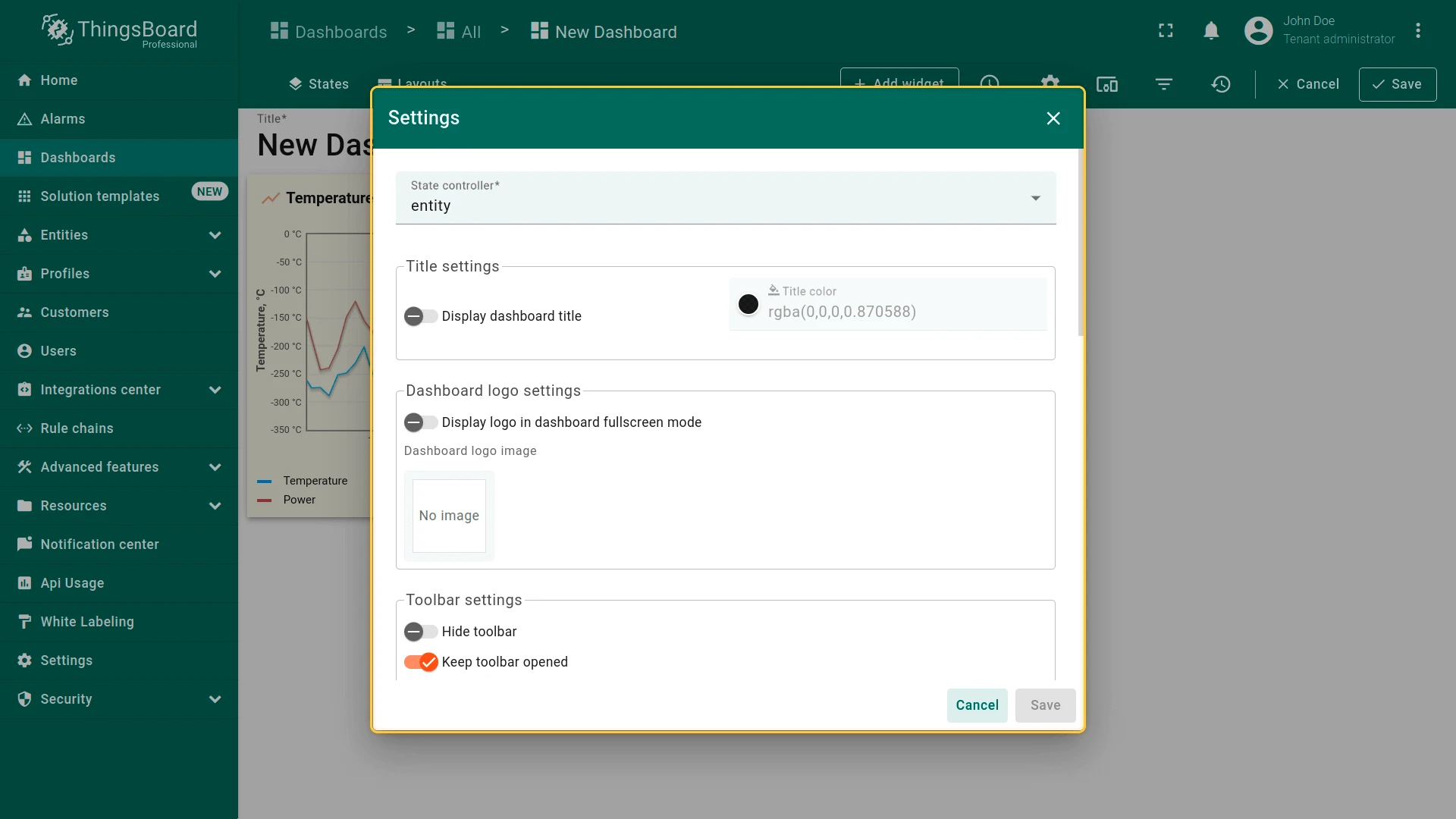
Section titled “Dashboard Settings”Click the gear icon in the edit mode toolbar to configure dashboard appearance and behavior: state controller, title, logo, toolbar visibility, layout, and advanced CSS.
State Controller
Determines how dashboard states are driven. Default: entity — state is bound to the currently selected entity context.
Title
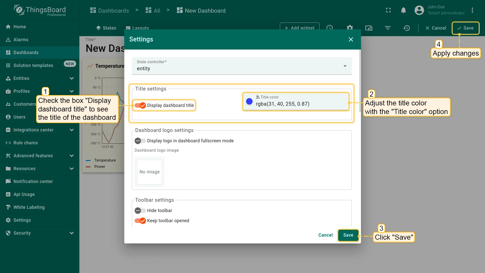
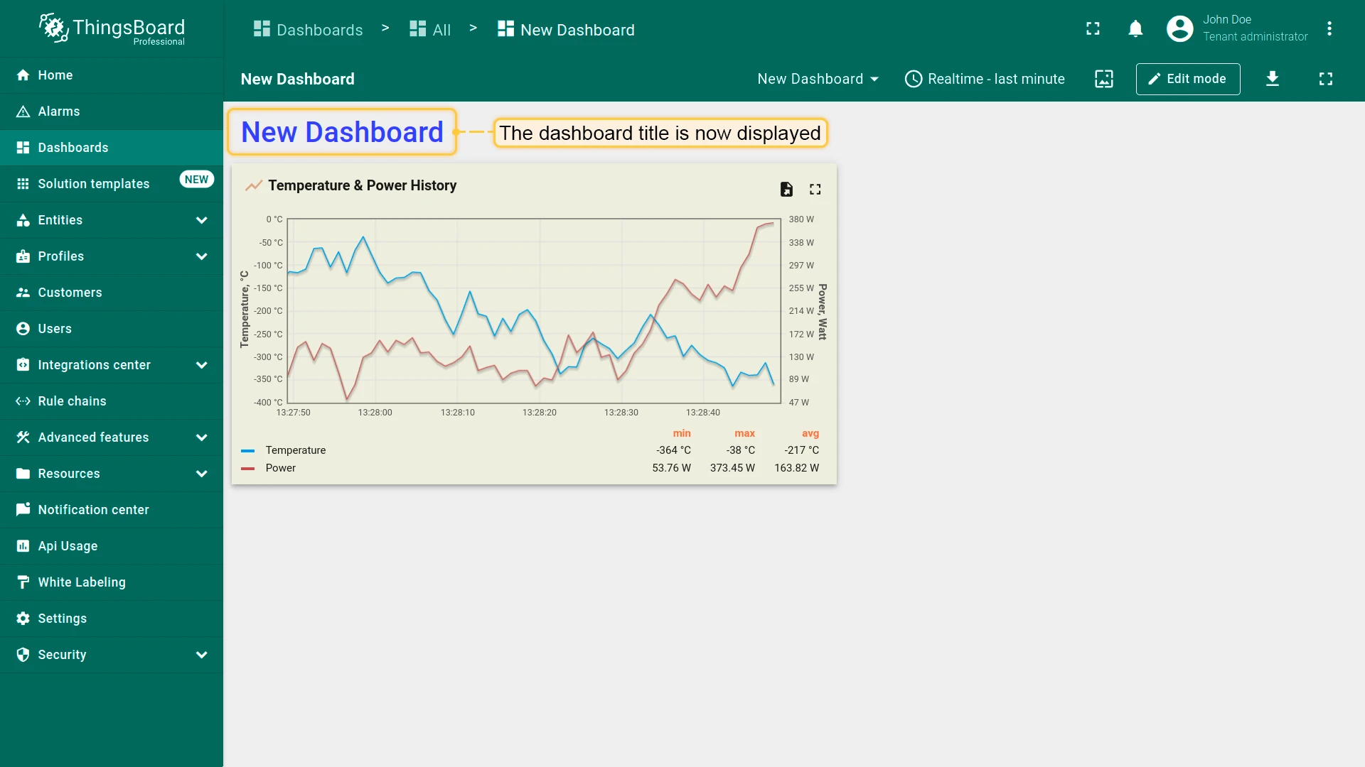
Enable display dashboard title to show the title in the top-left corner. Adjust color and transparency with the color picker.
Logo
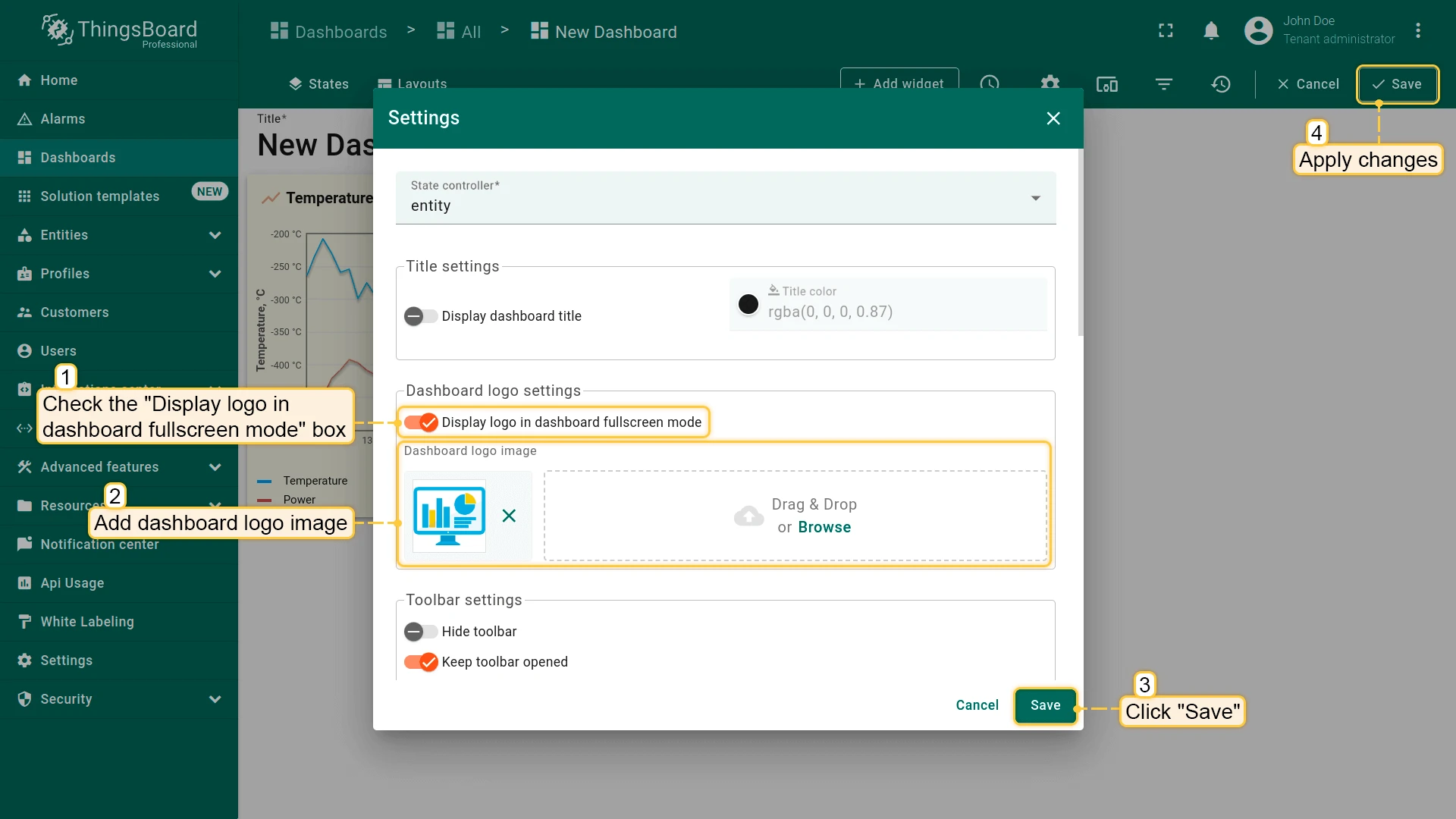
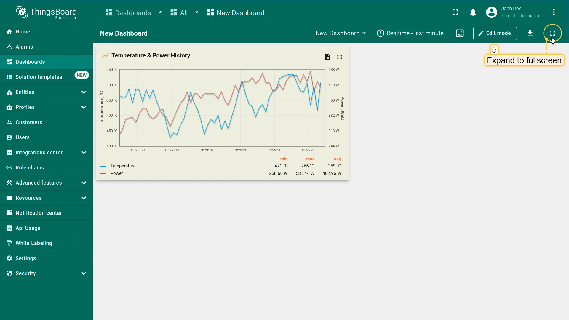
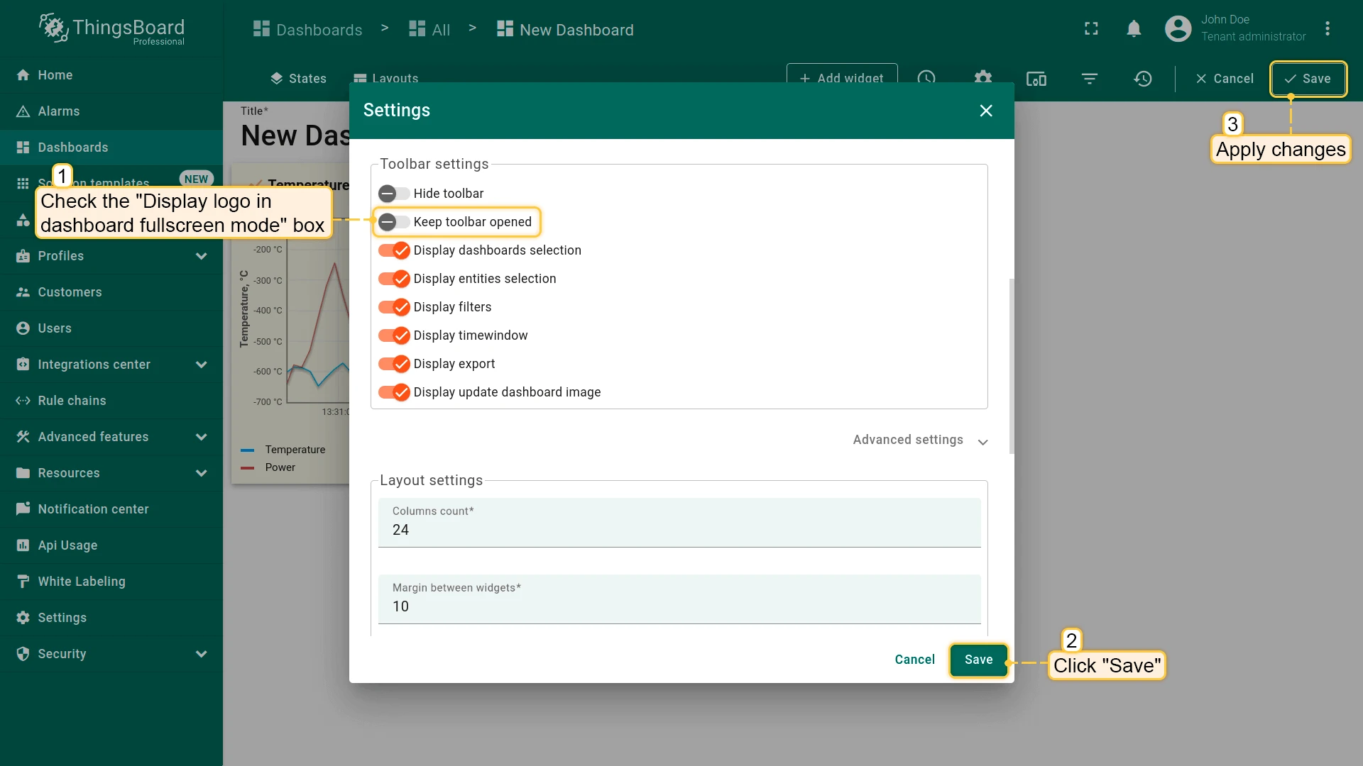
Enable Display logo in dashboard fullscreen mode and upload an image. The logo appears in the top-left corner when the dashboard is in fullscreen.
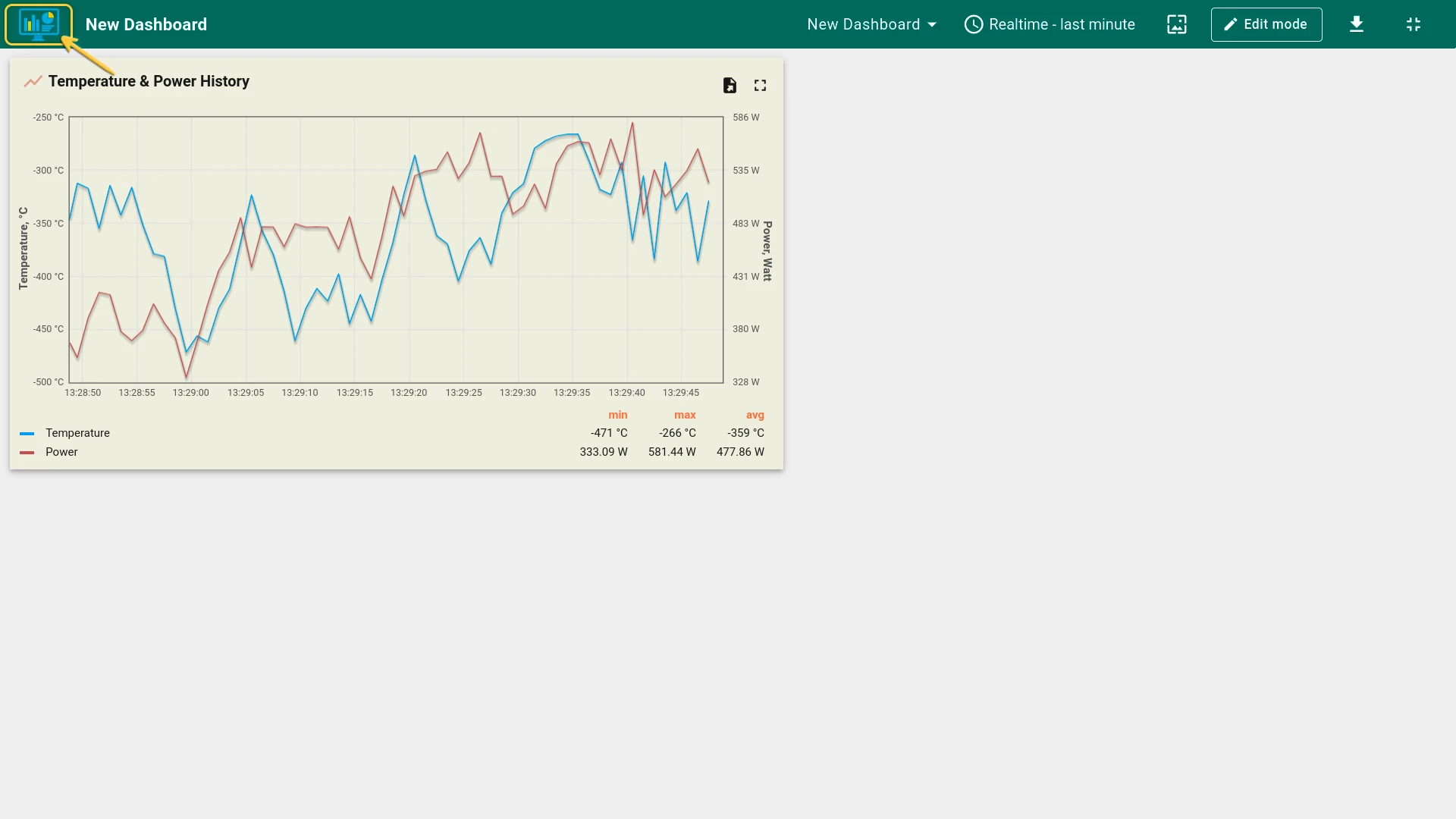
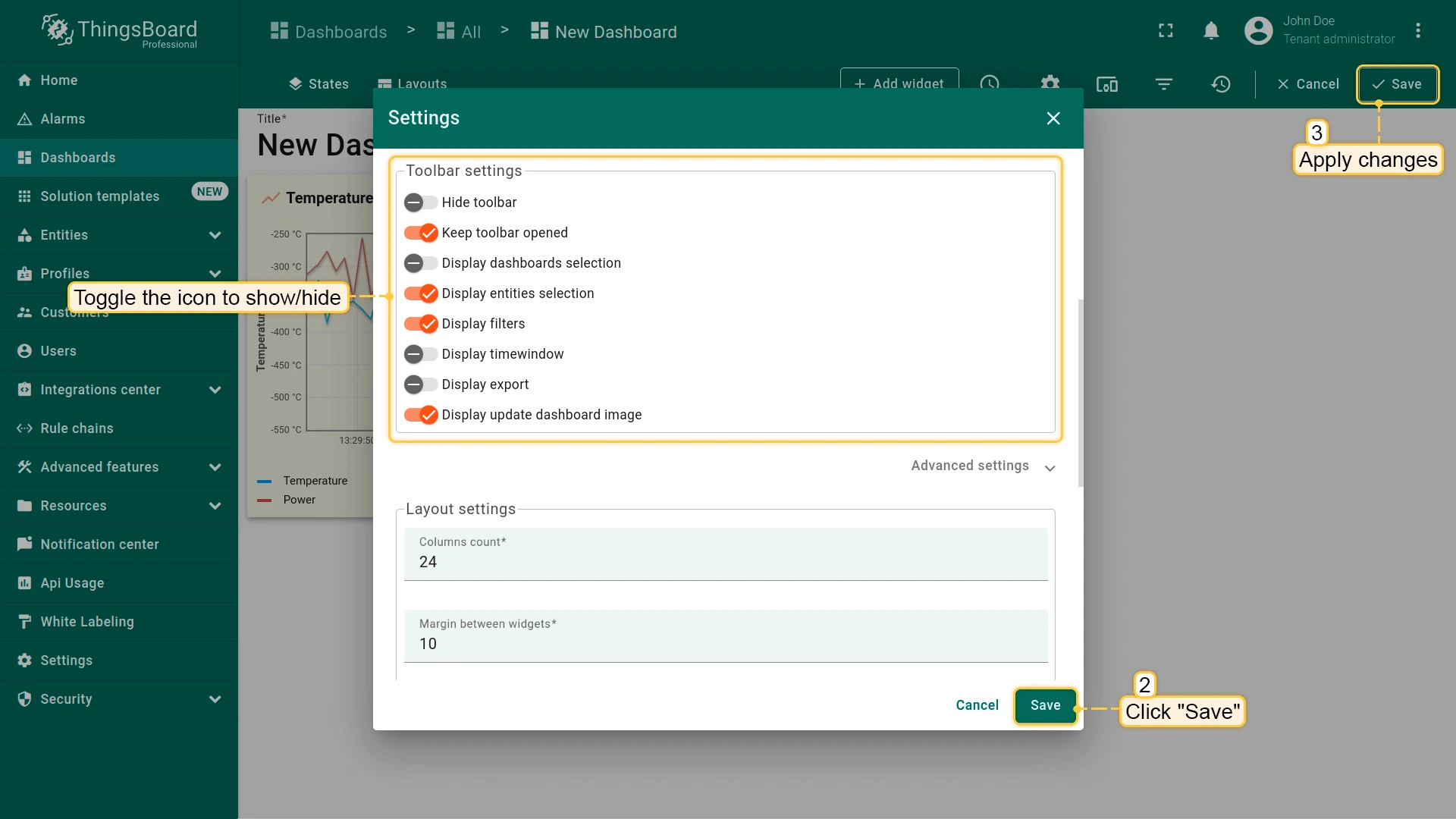
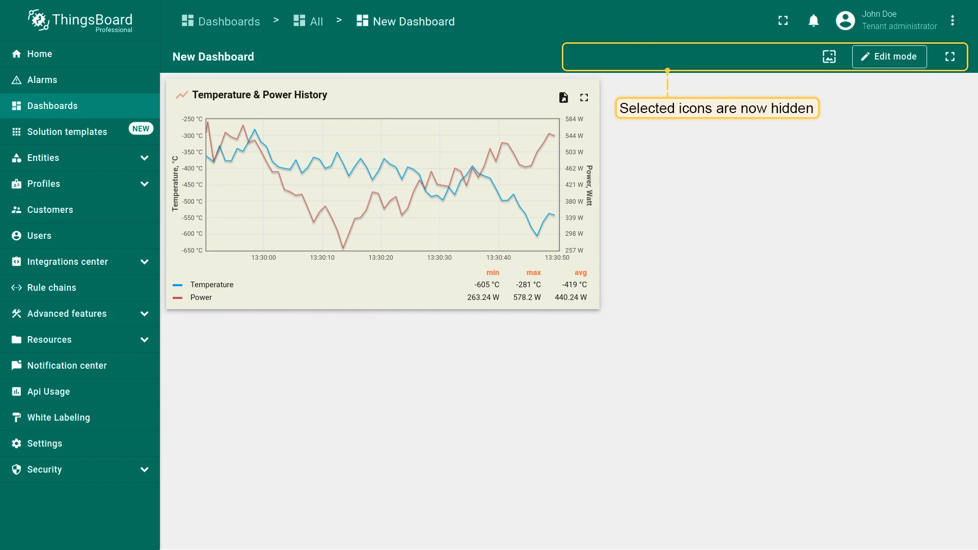
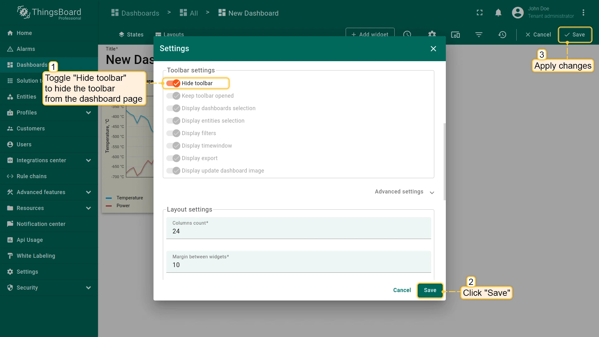
Toolbar Settings
Each checkbox controls the visibility of a toolbar option.
| Toggle | Description |
|---|---|
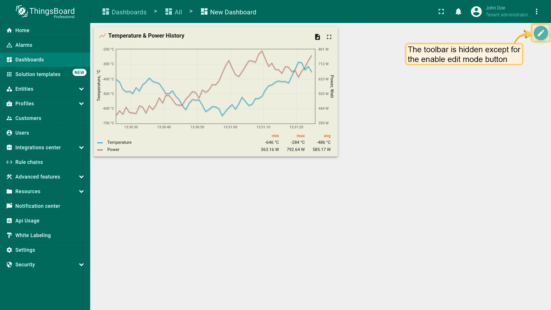
| Hide toolbar | Entirely hides the toolbar; only the Enter edit mode (pencil) icon is displayed in the top-right corner. |
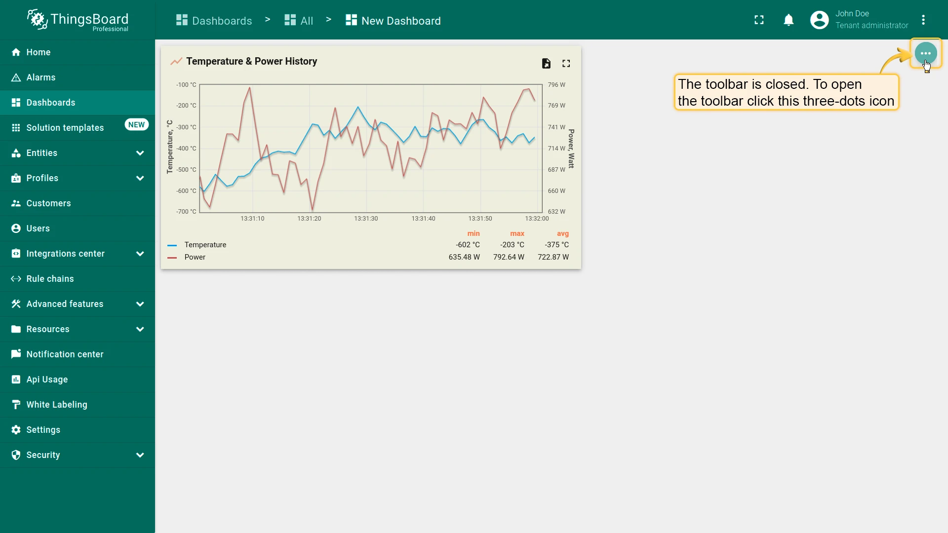
| Keep toolbar opened | Keeps the toolbar always expanded; when off, it collapses into a three-dots menu. |
| Display dashboards selection | Shows or hides the dashboards selector in the toolbar. |
| Display entities selection | Shows or hides the entities selector in the toolbar. |
| Display filters | Shows or hides the filters button (only if filters are defined). |
| Display time window | Shows or hides the time window control. |
| Display export | Shows or hides the export button. |
| Display update dashboard image | Shows or hides the update dashboard image button. |
Advanced Settings
Dashboard CSS — apply custom CSS scoped to the dashboard.
Layout Settings
Configure the default layout grid and appearance. See Layouts for layout types and breakpoints.
- Columns count — number of columns in the dashboard grid (default: 24).
- Minimum layout width — minimum width in columns before the layout scrolls horizontally.
- Margin between widgets — spacing between widgets in pixels.
- Apply margin to the sides of the layout — adds outer padding around the widget grid.
- Auto fill layout height — stretches the layout to fill the full page height.
- Background color — sets a solid background color for the dashboard.
- Background image — sets a background image (browse from gallery or set a link); configure Background size mode (e.g. Fit width).
Mobile Layout Settings
- Auto fill layout height — applies auto-fill to the mobile layout.
- Mobile row height — height of each row in the mobile layout (default: 70 px).
Dashboard Time Window
Section titled “Dashboard Time Window”A time window sets the time range — and, for historical data, the aggregation — applied to the data shown on a dashboard, for example “last 1 hour” or a fixed date range. See Time Window for the difference between real-time and history time windows and when to use each.
The dashboard-level time window, set from the toolbar, applies to all time series and alarm widgets unless a widget has its own time window configured.
Entity Aliases
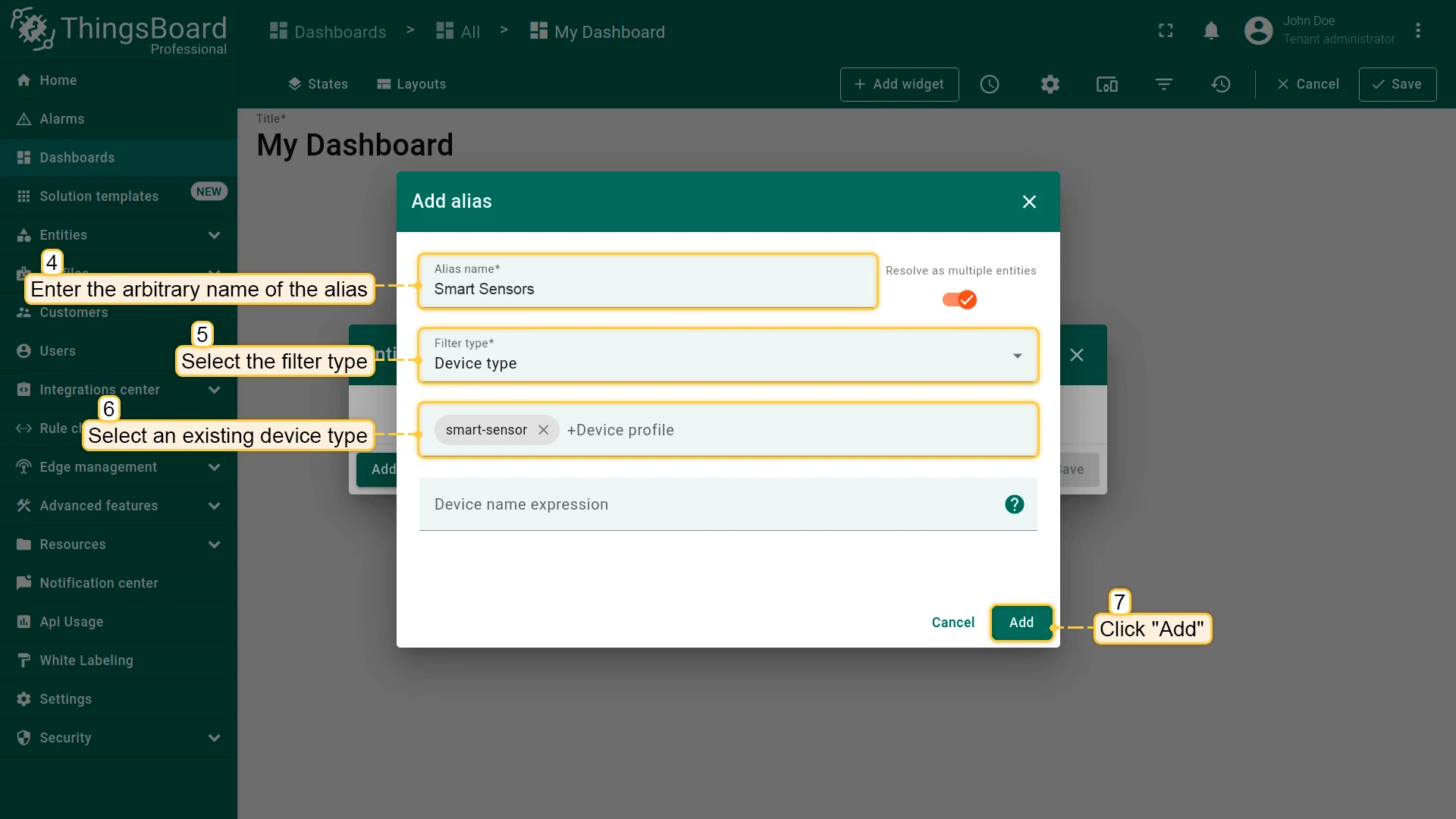
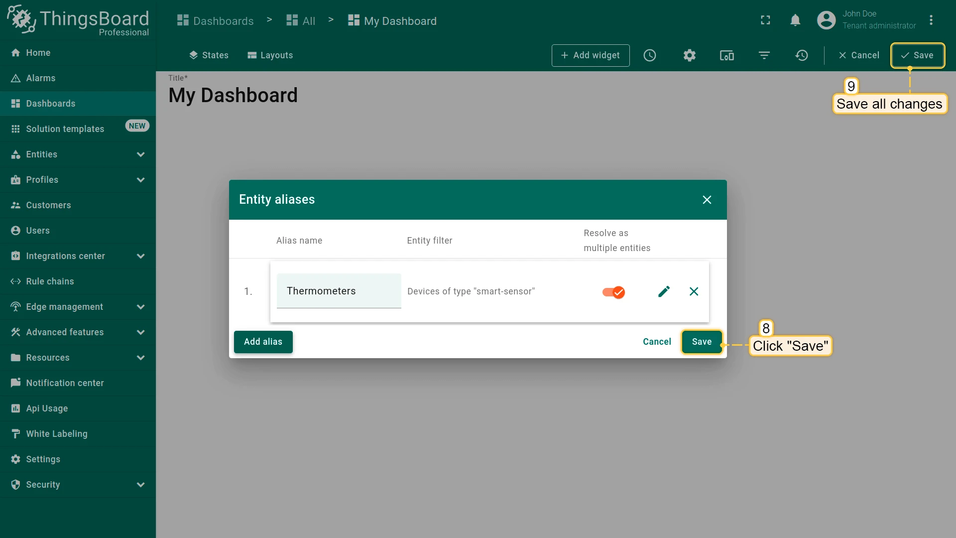
Section titled “Entity Aliases”An Entity Alias is a named reference that tells a widget which entity, or entities, to pull data from — for example, “all thermometers” or “the device selected in the current state”. See Entity Aliases for the difference between static and dynamic aliases and when to use each.
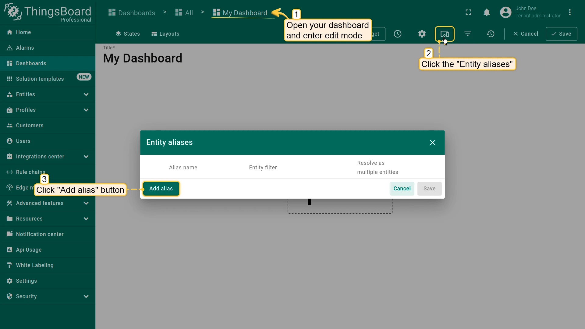
Manage a dashboard’s aliases from the toolbar: click the Entity Aliases icon in edit mode to open the aliases dialog, then add, edit, or delete the aliases used by the dashboard’s widgets.
Layouts
Section titled “Layouts”ThingsBoard uses a grid-based layout system to organize widgets within a dashboard. A single dashboard can include multiple layouts to support different visual configurations for various screen sizes and navigation scenarios.
See Layouts for full details, and Dashboard Settings for the grid, margin, and background fields configured per dashboard.
States
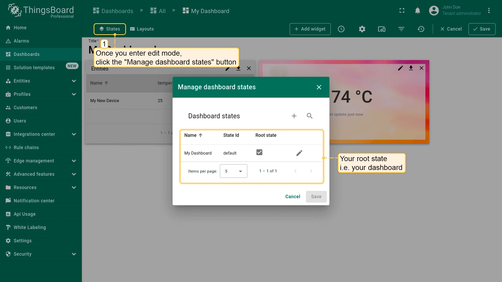
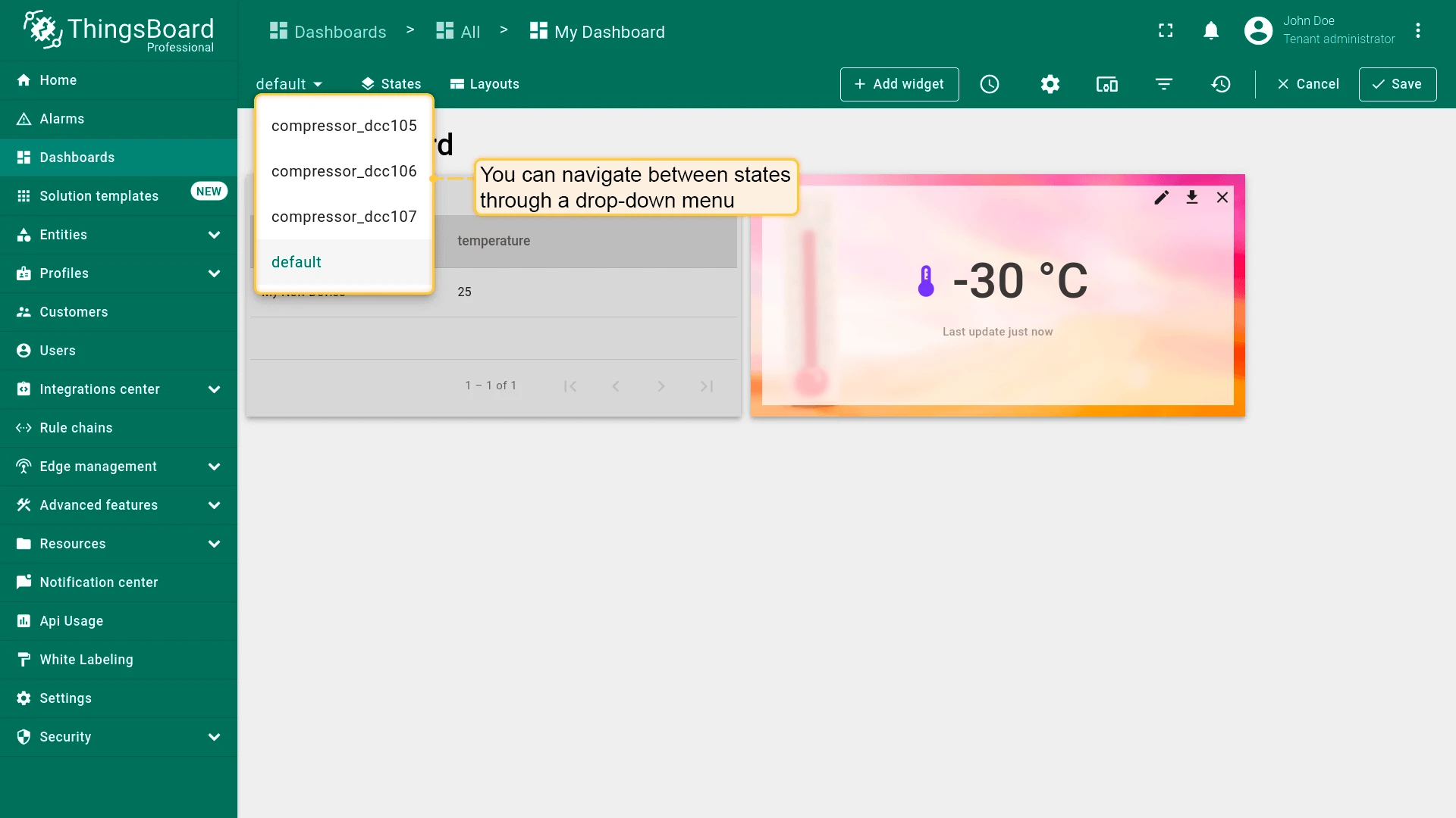
Section titled “States”A state is a named view within a dashboard — for example, a root state listing all devices and a detail state showing data for one selected device.
Navigating between states is done using customizable actions in widgets (see Navigate Between States below).
To manage states, in edit mode click the States icon (Manage dashboard states) in the toolbar.
Add a State
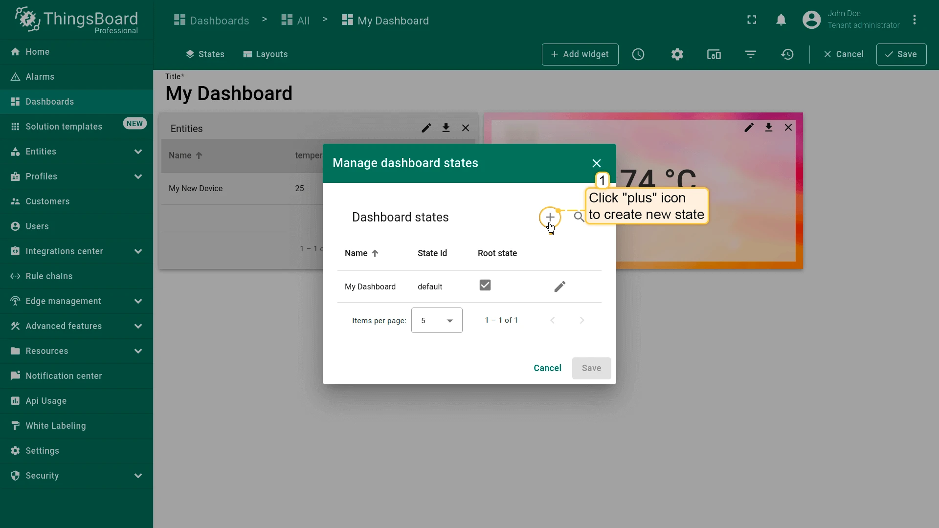
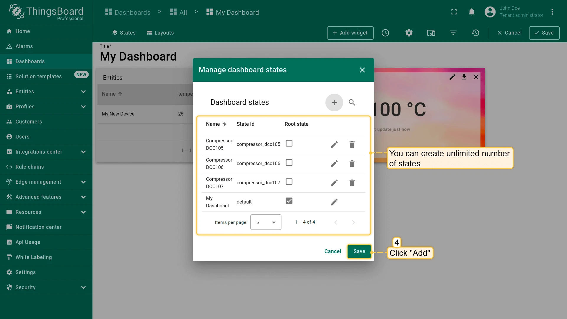
Section titled “Add a State”- In edit mode, click Manage dashboard states in the toolbar.
- Click the + icon in the top-right of the Manage dashboard states dialog.
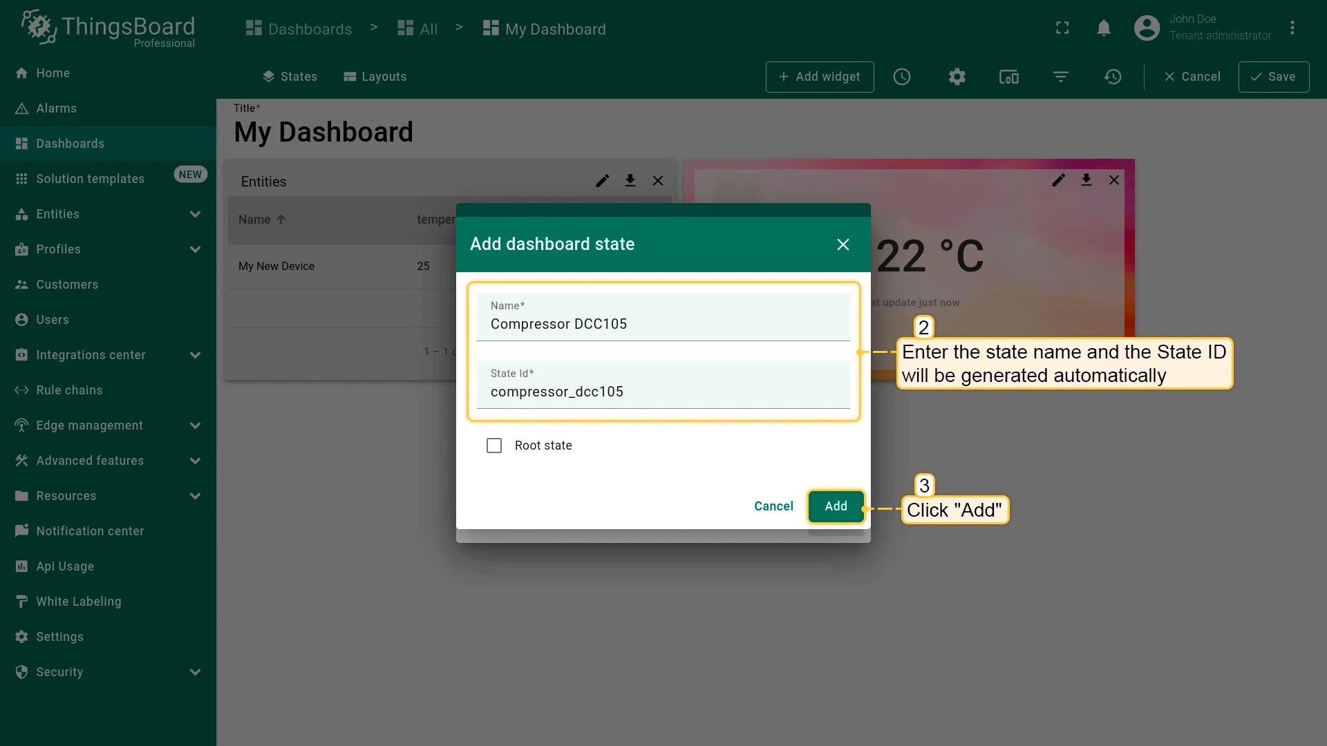
- Enter a state name (the State ID is auto-generated but editable). Use
${entityName}for dynamic naming. - Click Add, then Save.
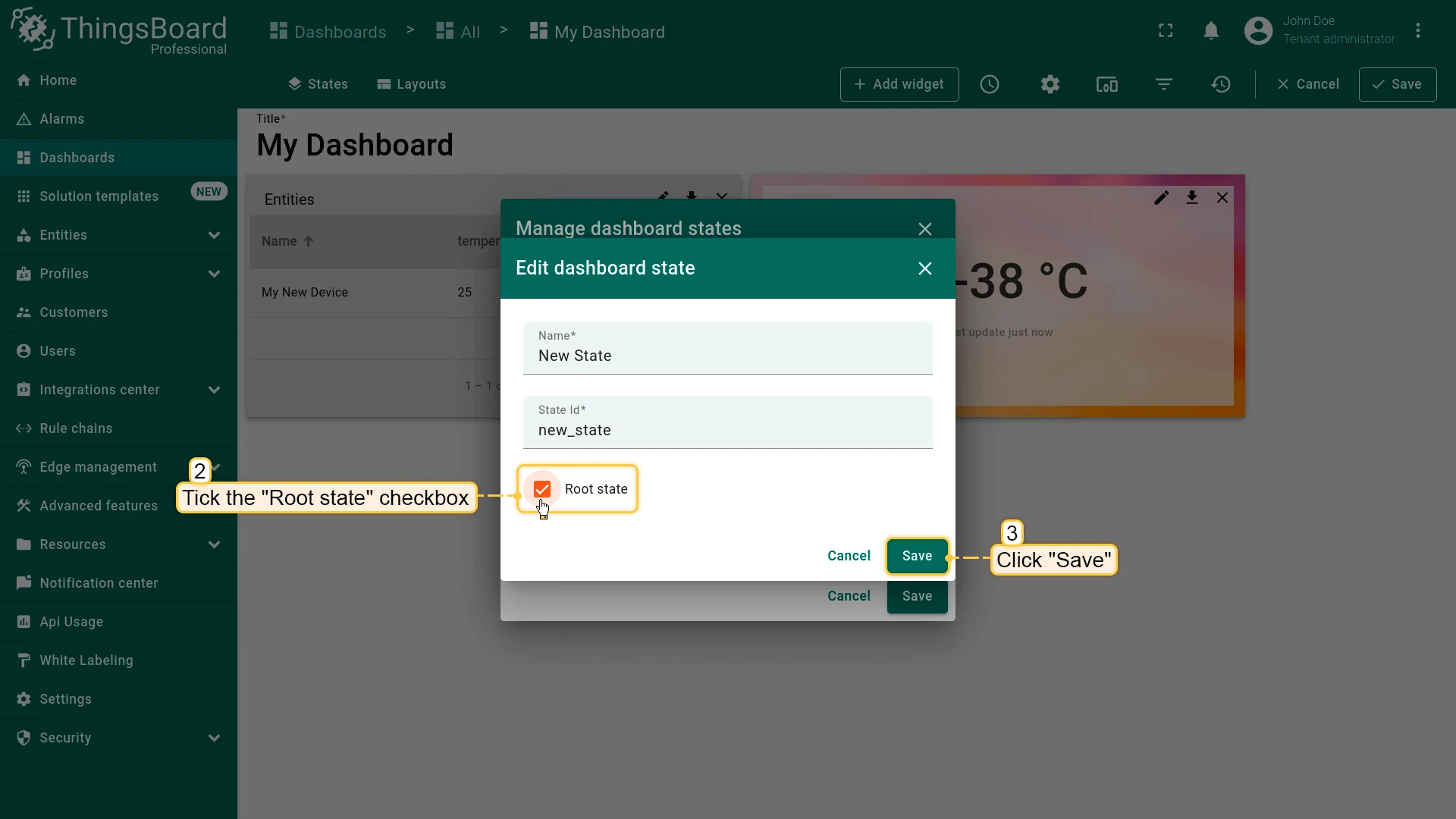
Root state
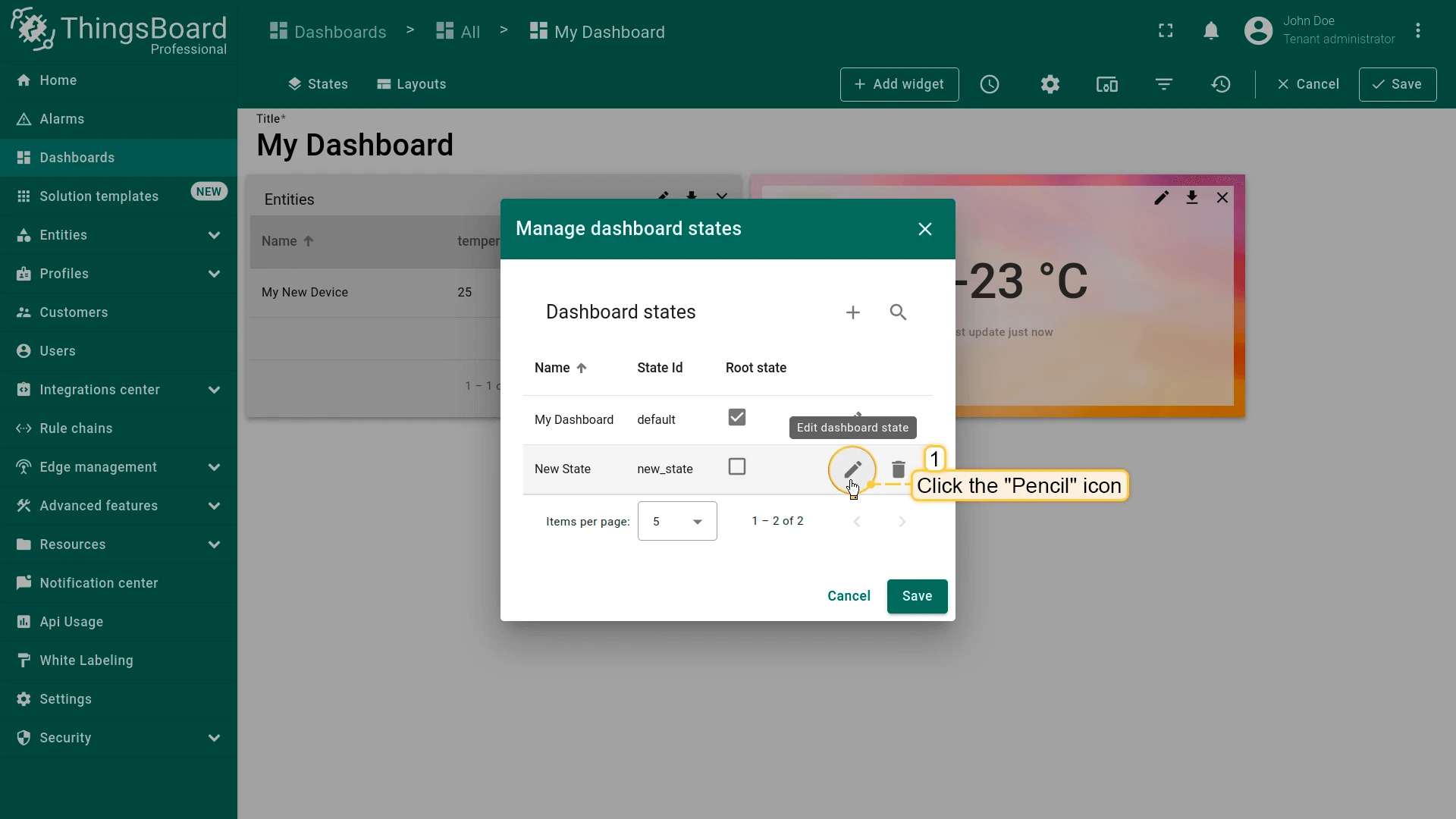
Every dashboard has one root state. To change it, edit the state and enable the Root state checkbox.
Navigate Between States
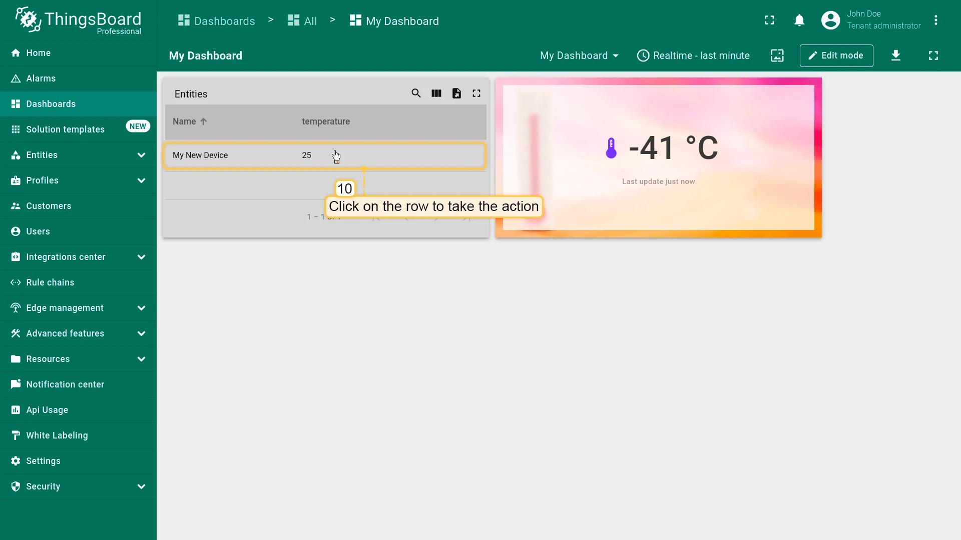
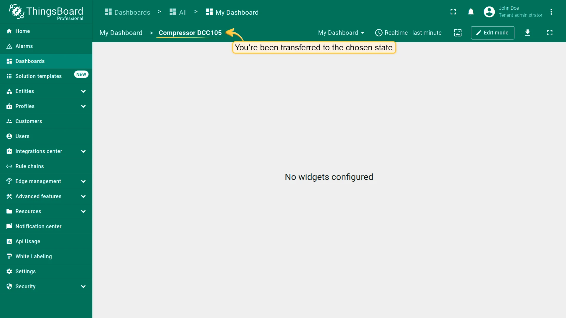
Section titled “Navigate Between States”To move between states, attach a Navigate to new dashboard state action to any widget. When the action is triggered — for example, by clicking a row in a table or a button in the widget header — the dashboard switches to the target state.
Before configuring the action, make sure you have already added the target state.
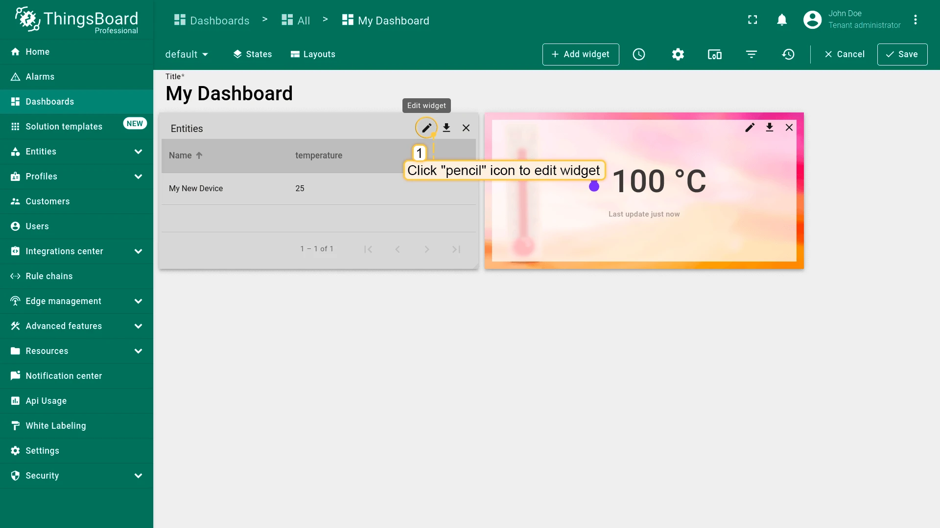
- Open the dashboard in Edit mode.
- Click the pencil icon on the widget to open its settings.
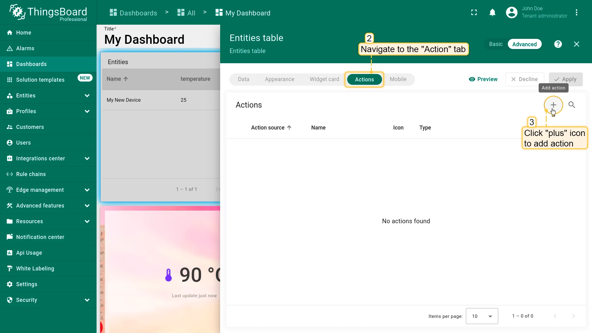
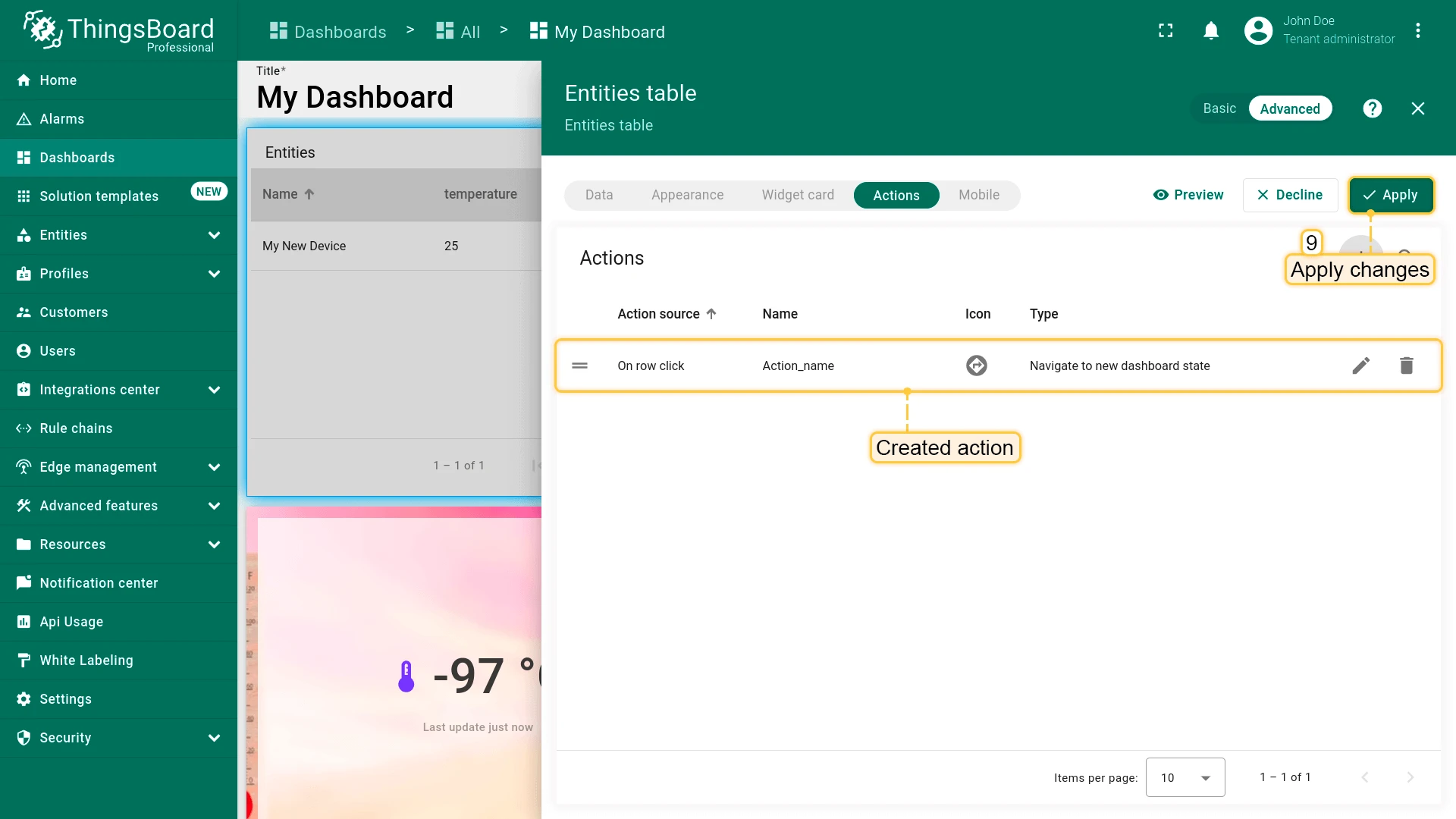
- Go to the Actions tab and click + Add action.
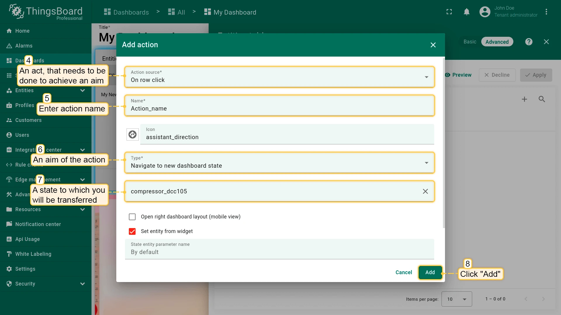
- Set Action source (e.g., Widget header button or On row click), enter a Name, and set Action type to Navigate to new dashboard state.
- Select the Target state from the dropdown and click Add.
- Click Apply, then Save the dashboard.
Manage Owner and Groups
Section titled Manage Owner and GroupsReassign a dashboard to a different owner (the tenant or a customer) and organize it into a dashboard group. Grouping matters because dashboards are shared or made public as a group, not individually — see Share Dashboard with Customers and Make Dashboard Public.
Typically used by a Tenant Administrator managing who owns and can access a dashboard.
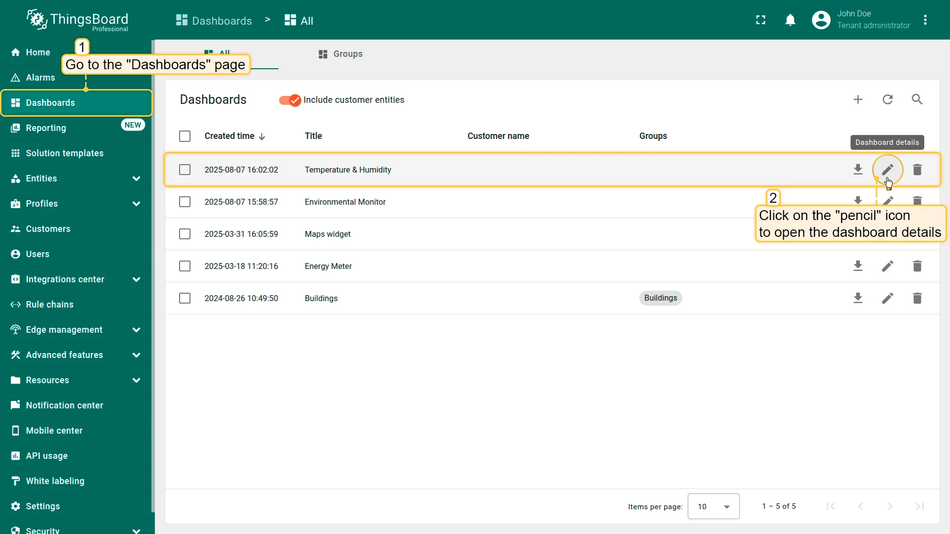
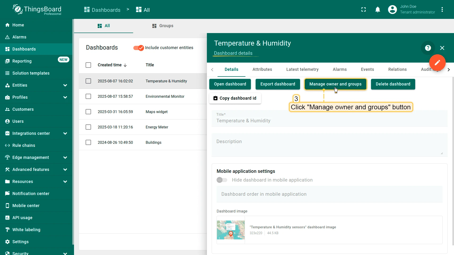
- Go to the Dashboards page.
- Click the Manage owner and groups icon next to the dashboard.
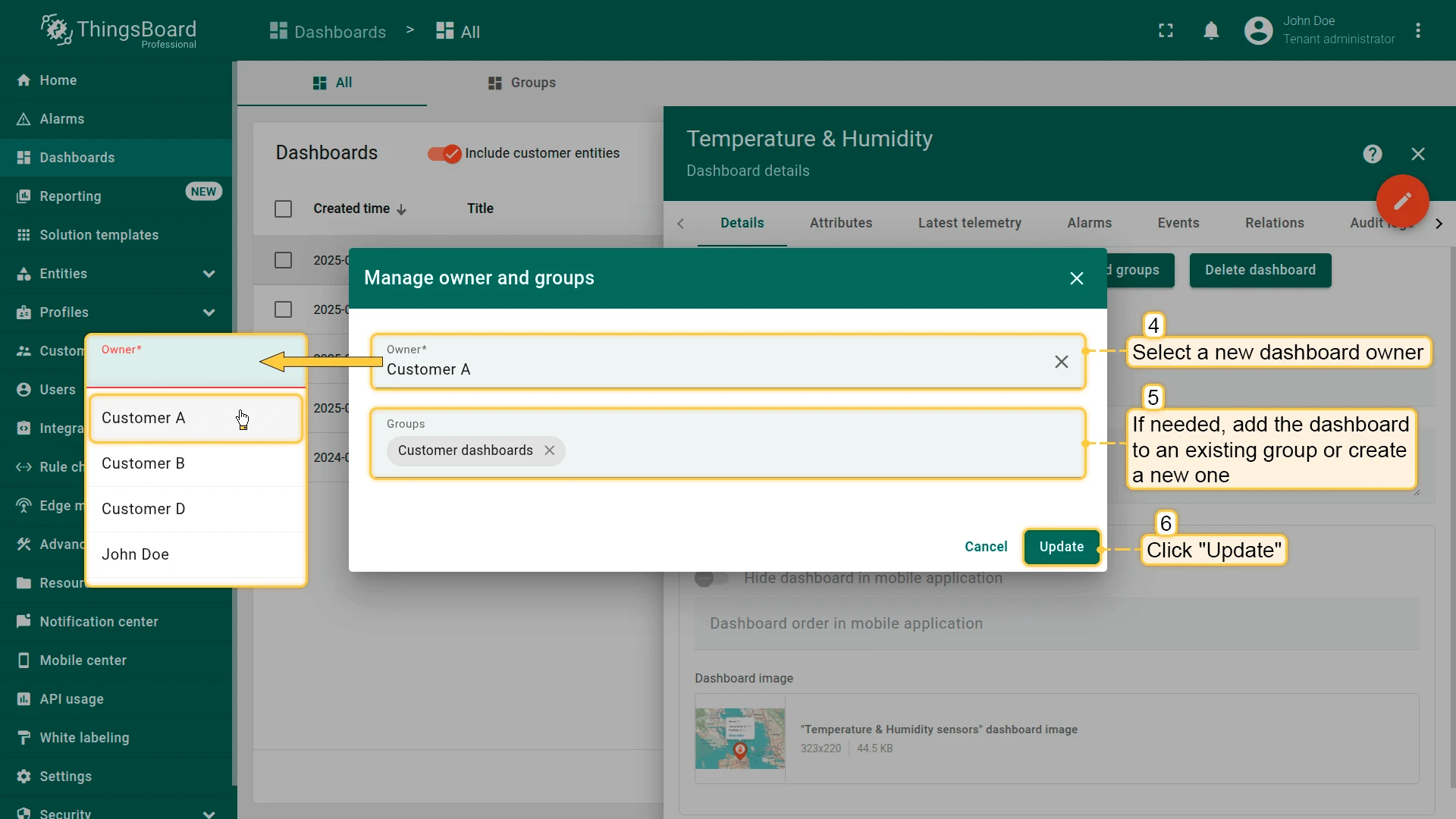
- In the Owner field, select a new owner from the dropdown.
- Optionally, select an existing dashboard group or create a new one.
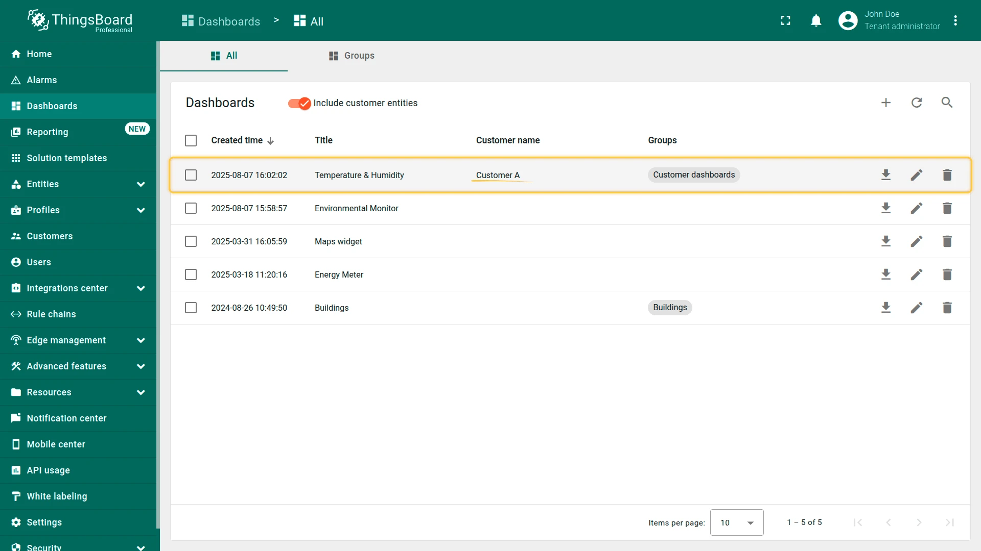
- Click Update.
Share Dashboard with Customers
Section titled Share Dashboard with CustomersShare Dashboard with Customers grants one or more customers secure, login-required access to every dashboard in a group.
Use it when the customer should log in to see only their own data. You can also grant write access, not just read-only. For access that doesn't require a login — public monitoring screens, partners, embedded views — use Make Dashboard Public instead.
Dashboards are shared as part of a dashboard group, not individually — see Manage Owner and Groups to add a dashboard to a group.
Typically used by a Tenant Administrator onboarding a customer, or a Customer Administrator granting access to their own sub-customers or users. See Customers for how customer accounts work.
When sharing, choose a permission level:
- Read — the customer can view the dashboards but cannot modify them.
- Write — the customer can view and edit the dashboards.
- Role — apply a previously created custom Role with fine-grained permissions.
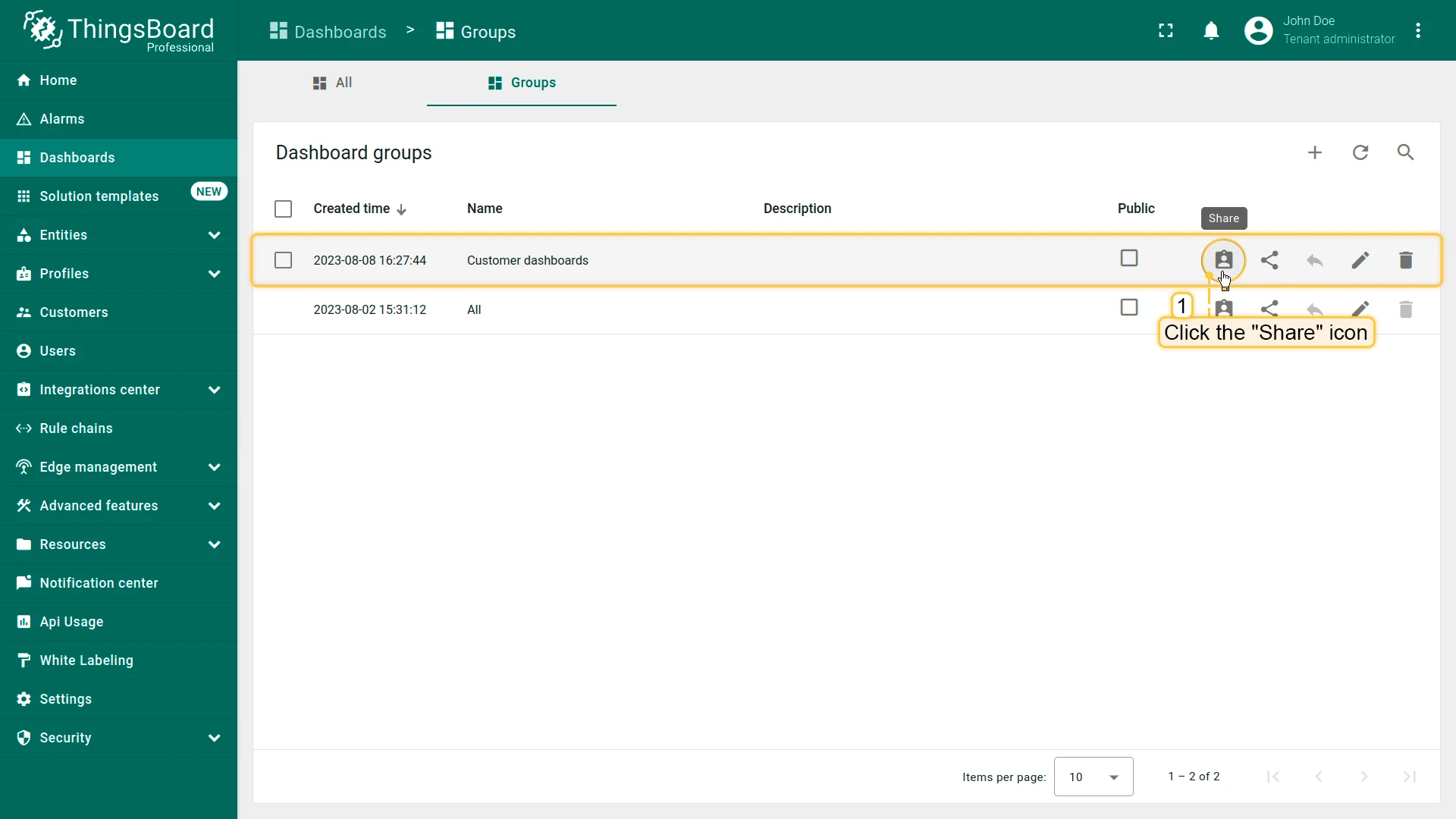
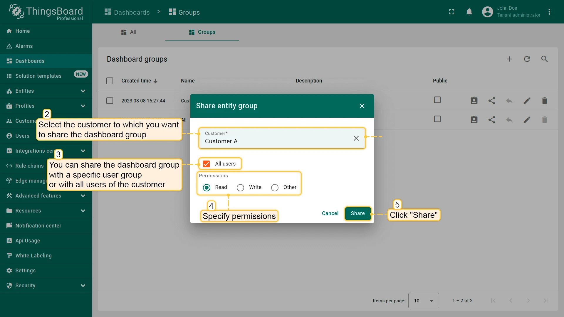
- Go to the Dashboards ⇾ Groups.
- Click the Share icon next to the dashboard group.
- Select the customer(s) to share with.
- Set the permission: Read, Write, or select a previously created Role.
- Click Share.
Make Dashboard Public
Section titled Make Dashboard PublicA public dashboard is a dashboard anyone can open with a link — no ThingsBoard account or login required. Making a dashboard group public turns every dashboard in that group into a public dashboard.
This is different from sharing a dashboard group with a customer:
| Public dashboard | Shared with a customer | |
|---|---|---|
| Login required | No — anyone with the link | Yes — the customer's own account |
| Access level | Always read-only | Read, Write, or a custom Role |
| Best for | External viewers with no account | Ongoing access for a specific customer |
Common scenarios for public dashboards:
- Sharing dashboards with customers or partners who don't need (or shouldn't get) a login
- Embedding a dashboard in an external website or customer portal, e.g. in an iframe
- Public monitoring pages — lobby screens, kiosks, status pages
- Quick demos or one-off links where setting up a customer account isn't worth it
A public dashboard is always read-only: visitors can view widgets, change the time window, and switch dashboard states, but cannot edit the dashboard, and cannot see any other dashboards, tenant data, or ThingsBoard UI.
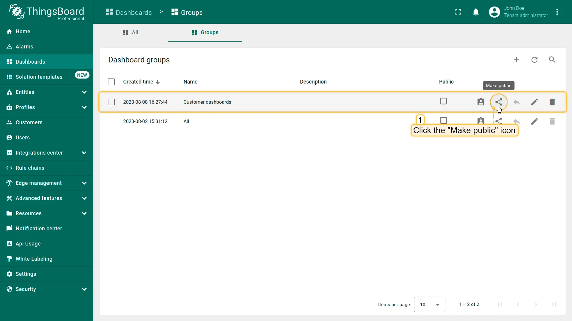
- Go to the Dashboards ⇾ Groups.
- Click the Make public icon next to the dashboard group.
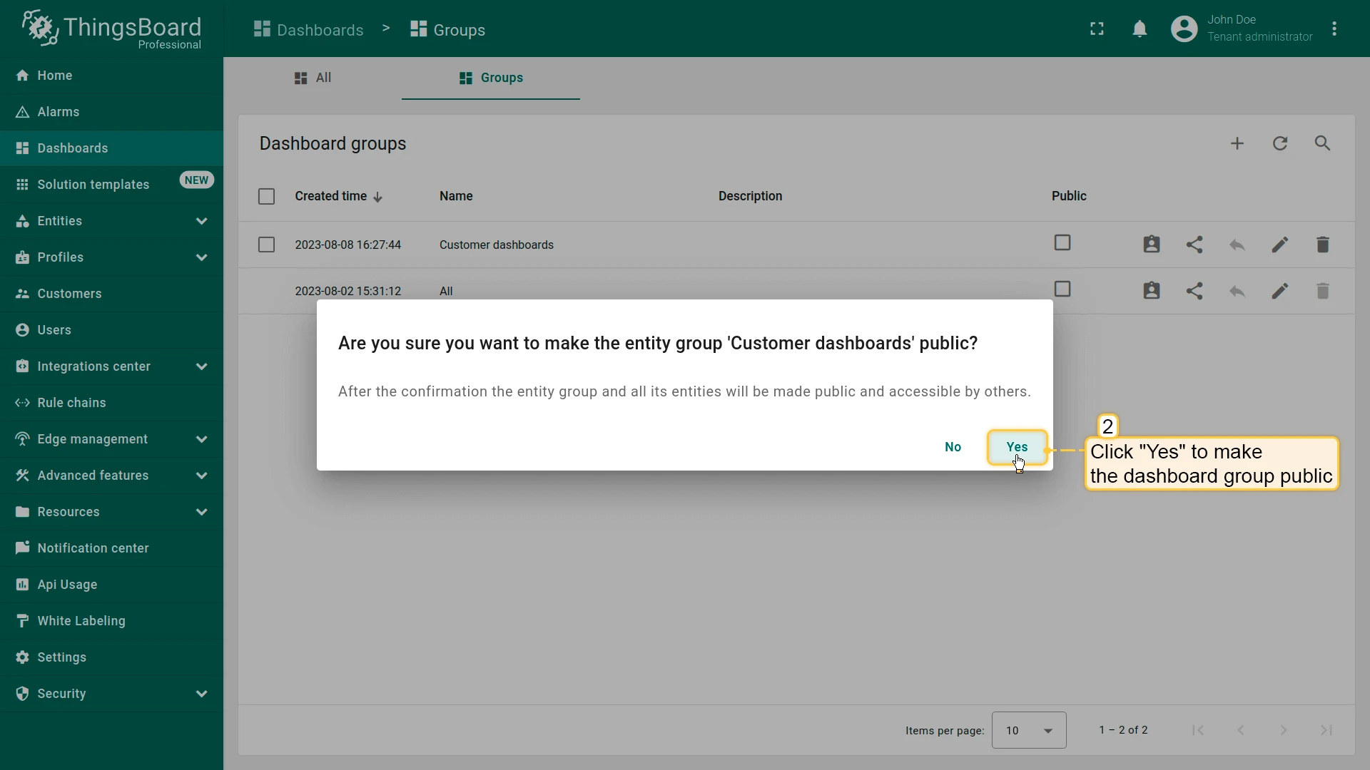
- Confirm making the group public.
Share a link to an individual public dashboard.
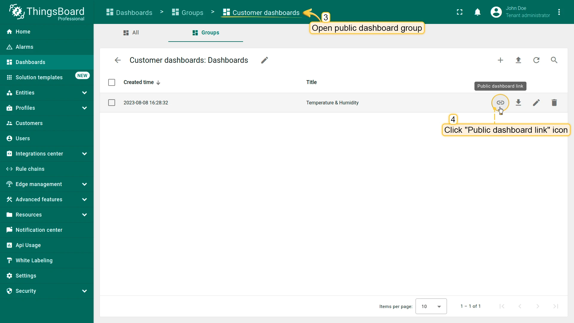
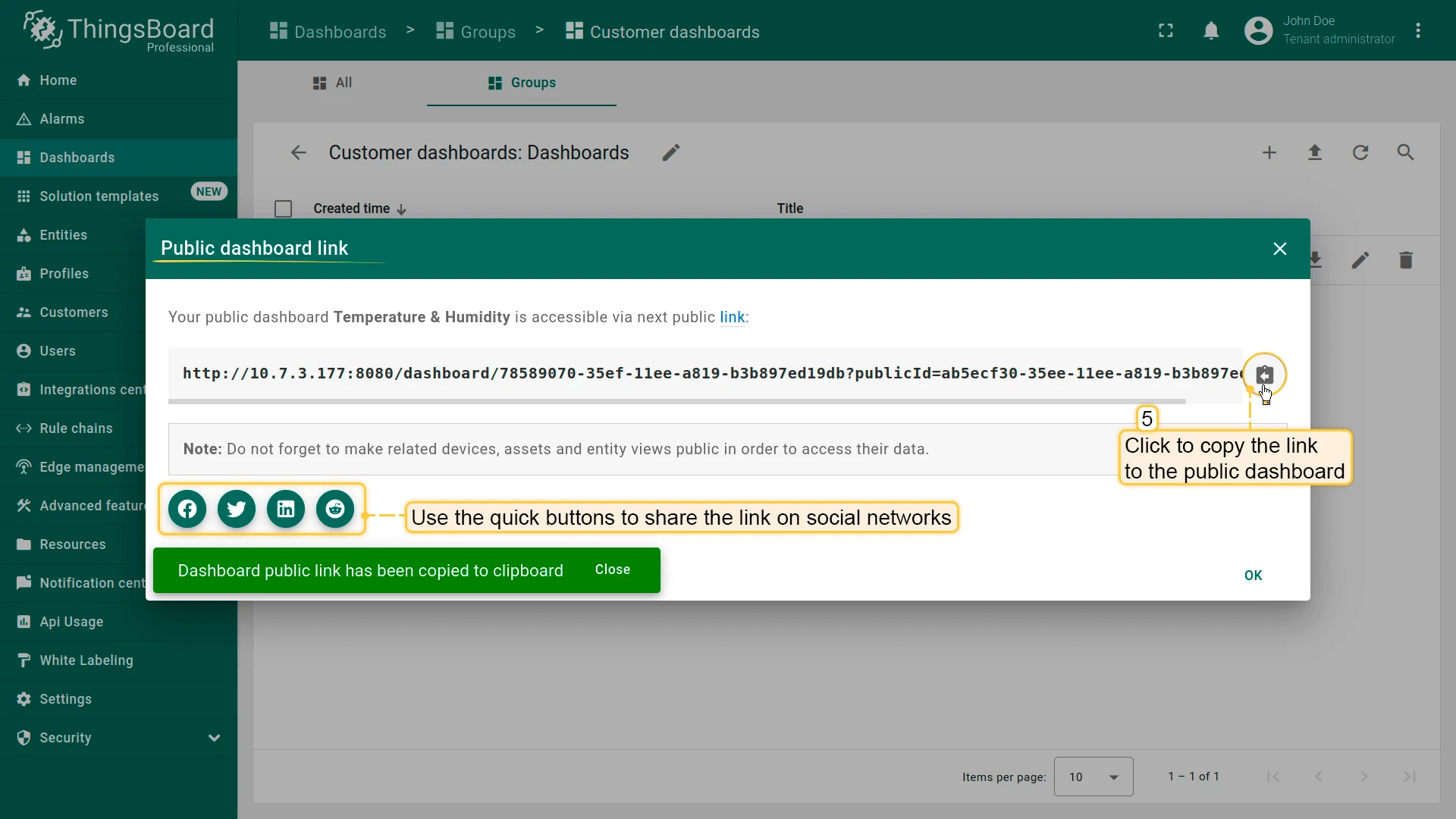
- Open the now-public group and click the Public dashboard link icon next to the desired dashboard.
- Click Copy public link and share it.
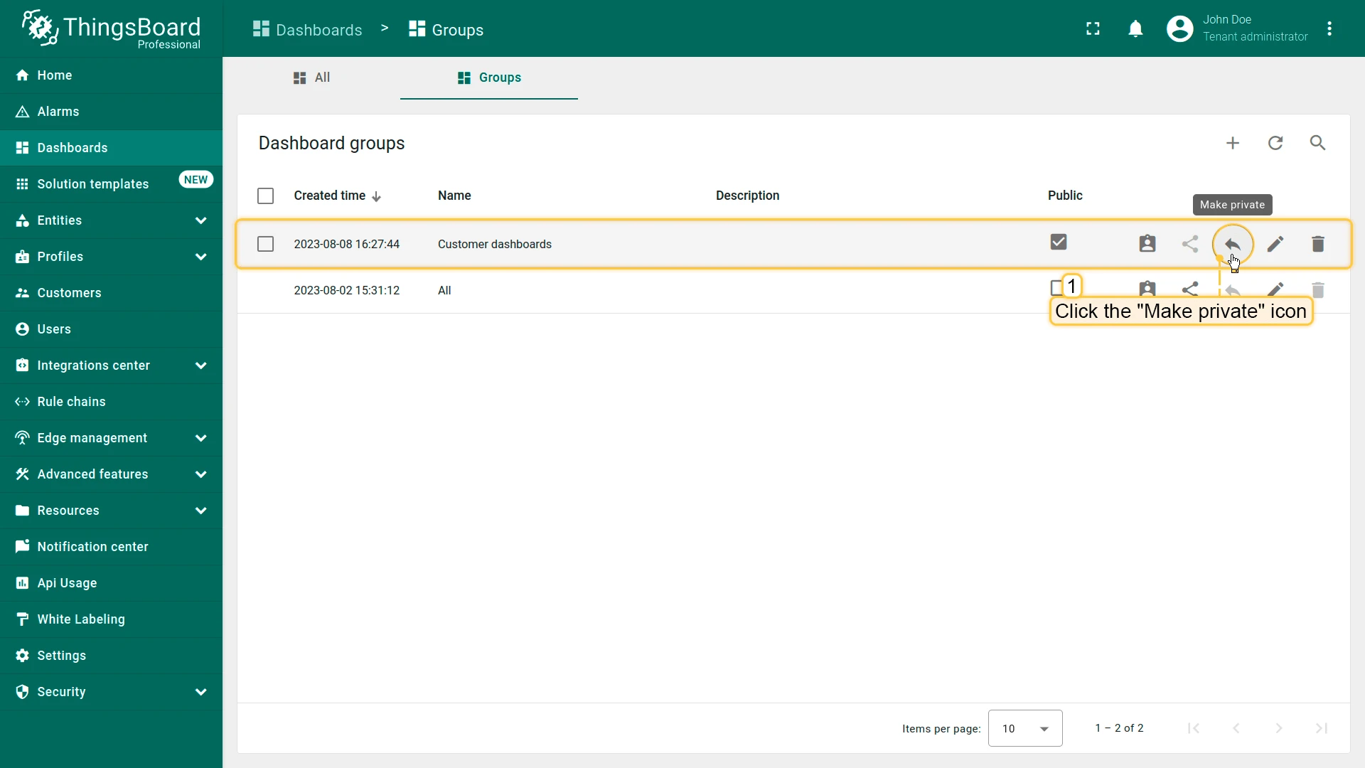
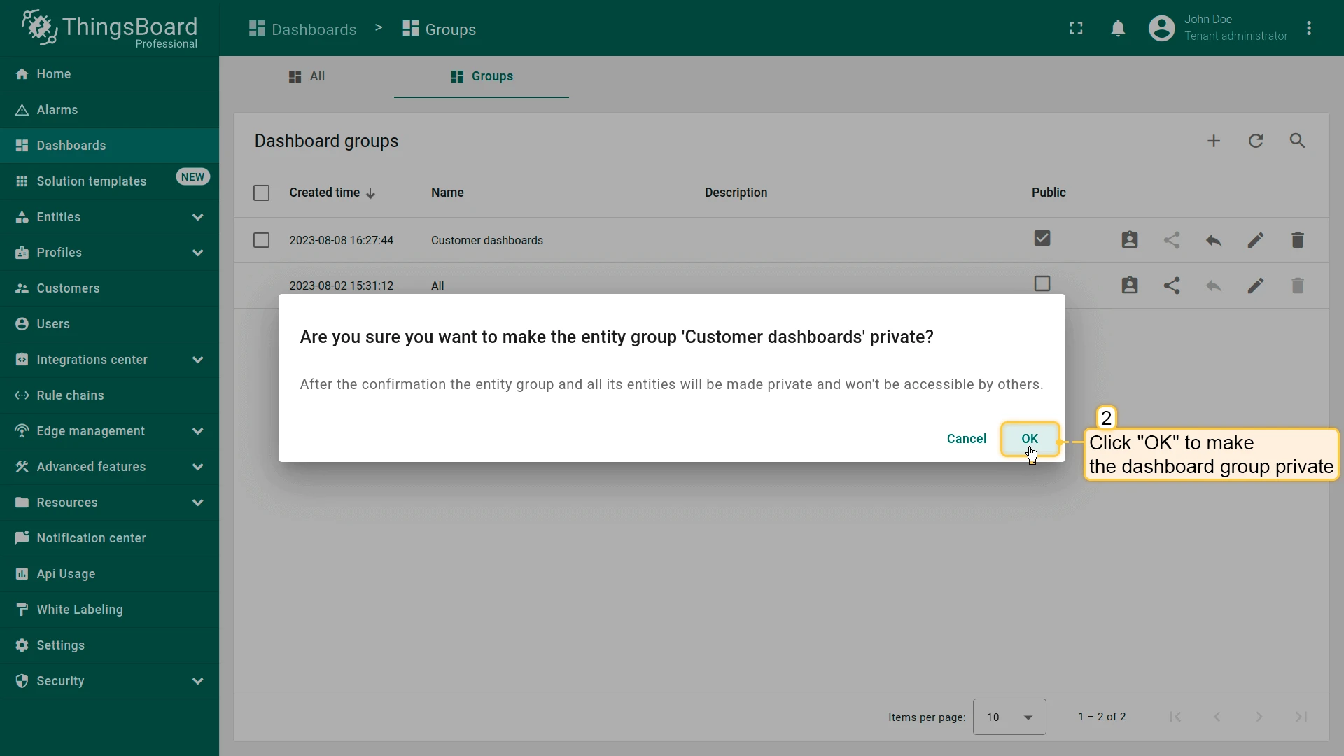
To revoke public access, click the Make private icon next to the dashboard group and confirm — this immediately disables every public link for that group.
Export and Import Dashboard
Section titled “Export and Import Dashboard”Export Dashboard
Section titled “Export Dashboard”Export a dashboard’s configuration as a JSON file. This captures the dashboard structure, widget settings, and layout — not a visual snapshot of the data.
Use this for:
- Backup — save a copy of a dashboard configuration
- Migration — move dashboards between ThingsBoard instances or environments
- Reuse — copy or duplicate an existing dashboard as a starting point for a new one
- Version control — store dashboard configurations alongside your project code (for automatic, ongoing versioning instead, see Dashboard Version Control below)
Two ways to export:
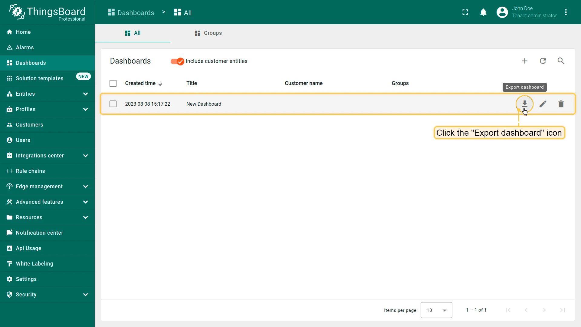
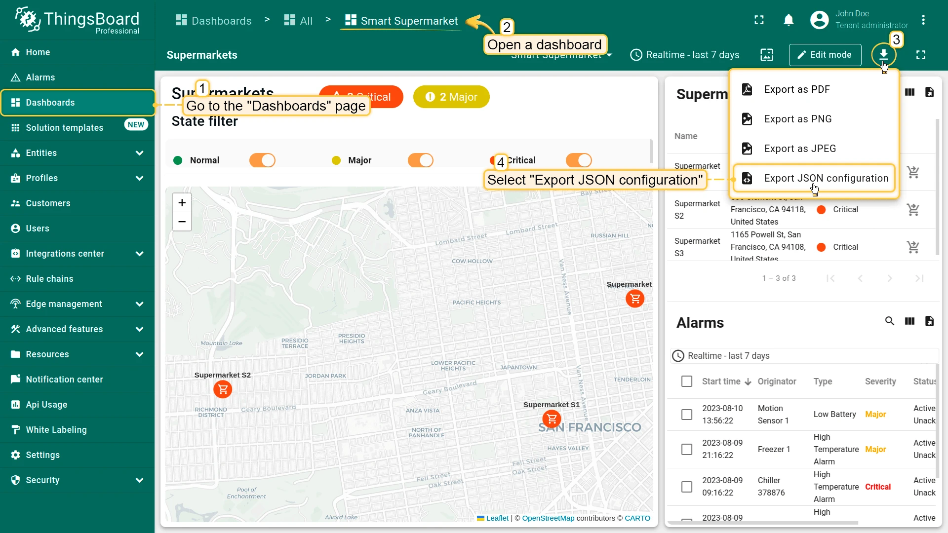
- On the Dashboards page, click the Export dashboard icon next to a dashboard.
- Inside a dashboard, click the Export dashboard button in the toolbar and select Export JSON configuration.
Export as PDF, PNG, or JPEG
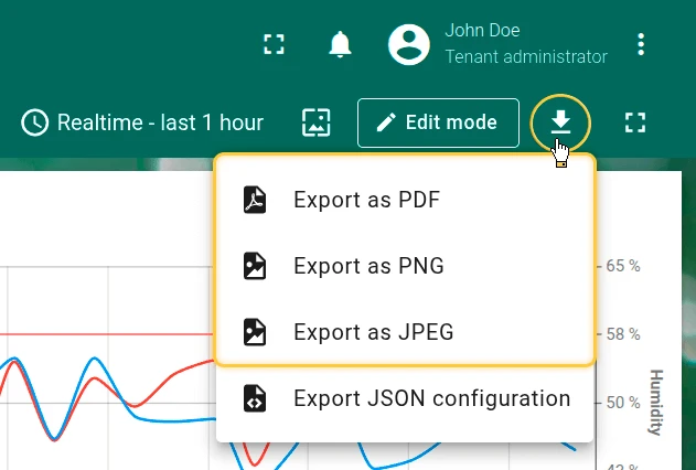
Section titled Export as PDF, PNG, or JPEGExport a visual snapshot of the current dashboard — a pixel-accurate capture of all widgets, charts, and data as displayed on screen at the time of export. Unlike the JSON export above, this captures how the dashboard looks, not how it is configured.
- Formats: PDF, PNG, JPEG
- Best for: sharing reports with stakeholders, printing dashboards, archiving a point-in-time view
Click the Export dashboard button on the right side of the toolbar, then select the desired format: PDF, PNG, or JPEG.
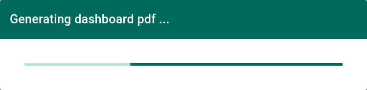
The snapshot is generated and automatically downloaded to your device.

Import Dashboard
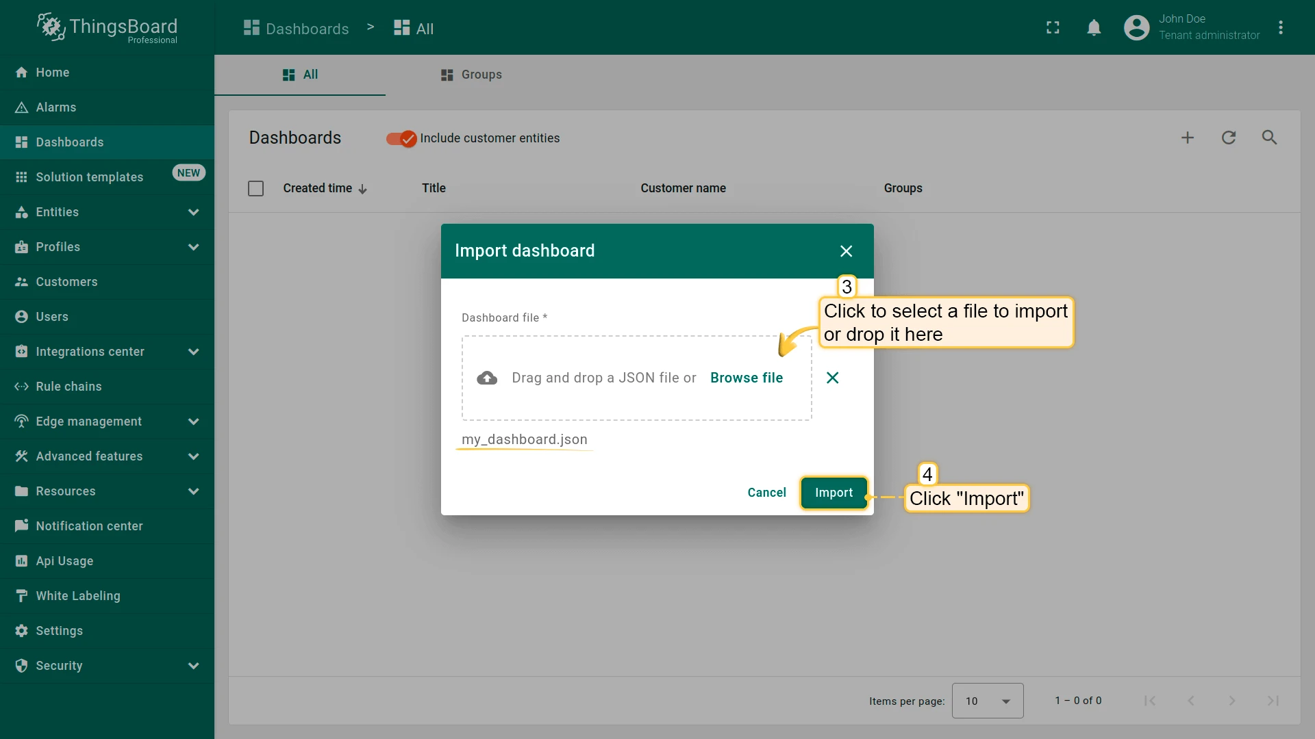
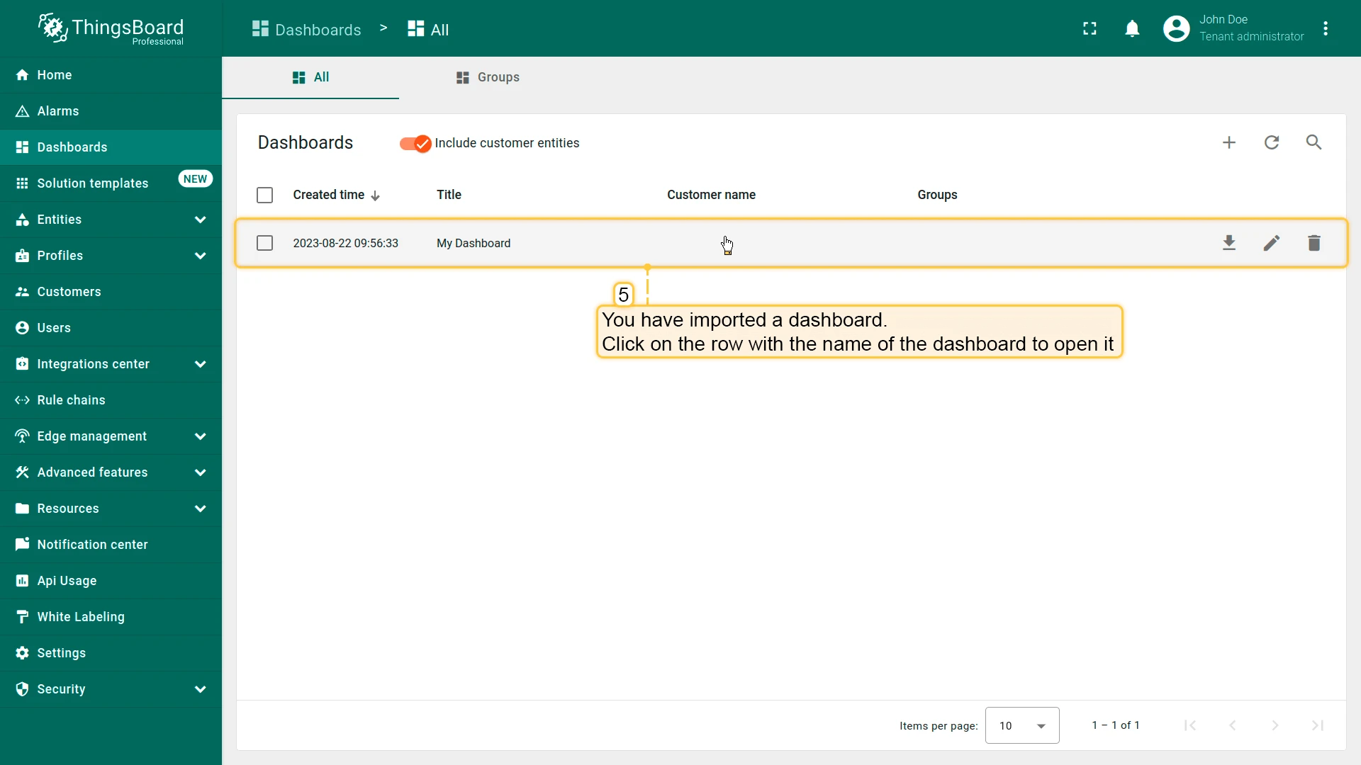
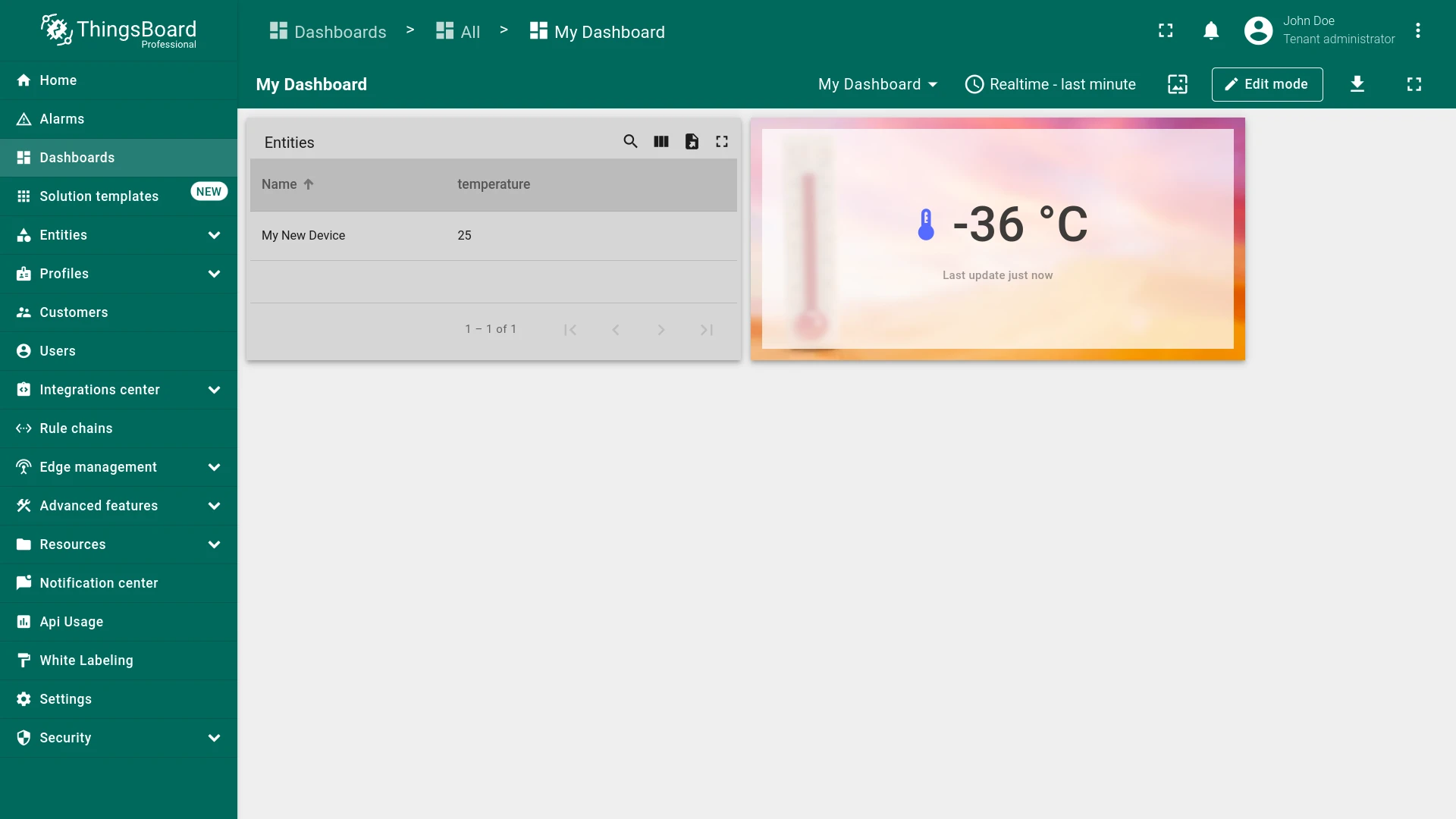
Section titled “Import Dashboard”Import a dashboard from a JSON configuration file.
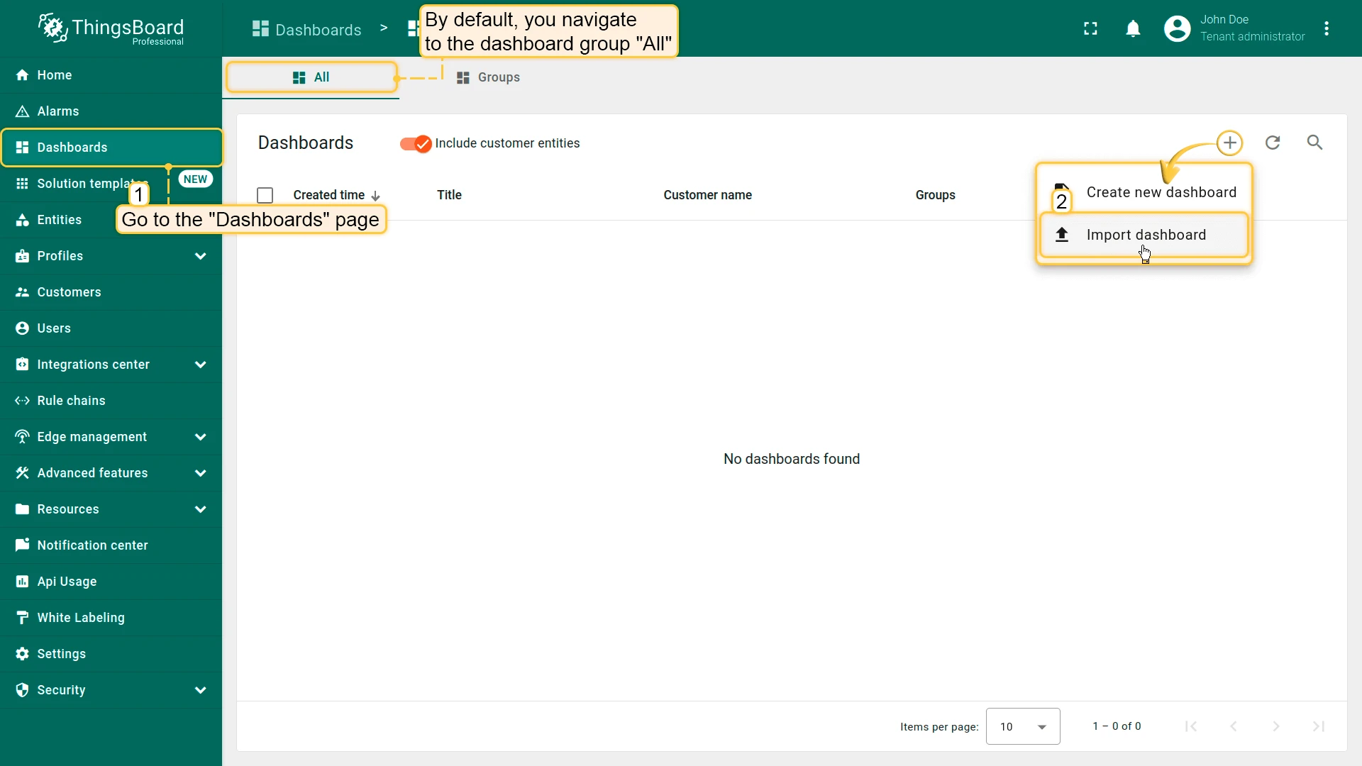
- Go to Dashboards.
- Click + Add dashboard ⇾ Import dashboard.
- Upload the
.jsonconfiguration file and click Import.
Dashboard Version Control
Section titled “Dashboard Version Control”Dashboard configurations can be exported to a remote Git repository, versioned, and restored at any point in time — enabling backup, rollback to a previous state, and collaborative management of dashboard changes across teams. Unlike a one-off JSON export, this keeps a full, ongoing history automatically.
See Version Control for full details.
Delete Dashboard
Section titled “Delete Dashboard”Click the trash icon next to the dashboard and confirm the deletion, or open the dashboard details and click Delete dashboard. To delete several at once, select their checkboxes in the list and use the bulk Delete action.
Home Dashboard
Section titled “Home Dashboard”The Home dashboard is the dashboard that opens when a user clicks Home in the left-hand navigation. If none is configured, ThingsBoard falls back to a built-in default Home page for that role.
A Home dashboard can be set at three levels, resolved in this order — the first one found is used:
- User — set individually per user account.
- Customer — set once for a Customer; applies to that customer’s users who haven’t set their own.
- Tenant — set once for a Tenant; applies tenant-wide to Tenant Administrators and, when neither a user-level nor customer-level Home dashboard is set, to customer users too.
Setting a User’s Home Dashboard
Section titled “Setting a User’s Home Dashboard”See User Details — the Home dashboard field is set individually per user from their user profile.
Setting the Tenant or Customer Home Dashboard
Section titled “Setting the Tenant or Customer Home Dashboard”A Tenant Administrator or Customer User can replace the default Home page for their entire tenant or customer:
- Build a Dashboard with the widgets/information you want to show, or import one.
- Go to Settings → Home.
- Select the dashboard in the Home dashboard field.
- Optionally enable Hide home dashboard toolbar to hide the toolbar when this dashboard is open.
- Click Save.
Once saved, that dashboard replaces the default Home page for every user of that tenant (or customer) who doesn’t have their own Home dashboard set individually.
Troubleshooting
Section titled “Troubleshooting”| Symptom | Cause | Fix |
|---|---|---|
| Widget shows no data | Its entity alias doesn’t resolve to any entity, or a filter excludes it | Check the alias in Entity Aliases, and any filters applied to the dashboard |
| Widget shows no data for a specific time range | The dashboard or widget time window doesn’t cover the period with data | Check the dashboard time window and any widget-level override |
| Public dashboard link opens but widgets are blank | The devices or assets behind the widgets aren’t public — only the dashboard was made public | Make the underlying entities public too — see Make Group Public or Private |
| Customer can’t see a shared dashboard’s data | The customer has access to the dashboard but not to the devices or assets it displays | Grant the customer access to the associated entities — see Share Dashboard with Customers |
| Import fails or the dashboard opens empty | The uploaded file isn’t a valid dashboard JSON export, or it was edited by hand | Re-export the original dashboard and import that file unmodified |
| Home page still shows the built-in default widgets (e.g. “Getting started”) | No Home dashboard has been configured for the user, customer, or tenant | Set one via Home Dashboard |
What You Can Do with Dashboards
Section titled “What You Can Do with Dashboards”| Capability | Description | Guide |
|---|---|---|
| Visualize IoT data | Add widgets to display telemetry, attributes, and alarms from any device or asset in real time or historically | Widgets |
| Configure the time window | Set the time interval and aggregation rules applied to all time-series widgets on the dashboard | Time window |
| Use entity aliases | Make widgets context-aware by resolving entities dynamically — by type, group, relation, or dashboard state | Entity aliases |
| Build multi-state navigation | Create separate dashboard states for detail views, drill-downs, or device-specific pages and navigate between them with widget actions | Navigate to new dashboard state |
| Configure widget actions | Trigger navigation, RPC commands, or attribute updates when users click on charts, table rows, or buttons | Widget actions |
| Control the dashboard layout | Arrange widgets on a responsive grid, configure mobile layout, and create multiple named layouts for different screen contexts | Layouts |
| Share with customers | Grant customers login-required access to a dashboard so their users see only their own data | Share Dashboard with Customers |
| Make a dashboard public | Publish a read-only link anyone can open without a ThingsBoard account — for embedding, public screens, or sharing outside your organization | Make Dashboard Public |
| Export and import | Export a dashboard as a JSON file and import it into another ThingsBoard instance for backup or reuse | Import and export |
| Version control | Track dashboard configuration changes, compare versions, and restore previous states using the version control service | Version control |
| Delete a dashboard | Permanently remove a dashboard you no longer need, individually or in bulk | Delete Dashboard |
| Replace the default Home page | Set a custom dashboard as the Home dashboard for a user, customer, or tenant | Home Dashboard |
Was this helpful?